Branding and identity
We create brands from scratch and refresh existing ones: naming and positioning, logo, visual identity, illustration, packaging and touchpoints.
Services
-
Logo design services
A logo is the way your name is written, or the symbol, that people recognise on a sign, on packaging, in an app icon and in a social media feed.
-
Brand identity design and brand book
A brand identity, or corporate identity, is the set of visual elements and rules that make a brand recognisable on any touchpoint: logo, colours, typefaces, graphics and illustration.
-
Packaging design
Packaging design isn’t one beautiful box but a system of touchpoints that makes an order recognisable before anyone opens it: boxes, bags, stickers, tape, cups, tray liners and menus.
What clients come with
- You’re starting a new business and need a brand from scratch
- You have a logo but no system, so every layout looks different
- Your brand looks dated or blends in with competitors
- You need packaging that people recognise and want to photograph
- You’re launching delivery, a new line or a new location and need its own style
What you get
- Research: market, competitors, audience and positioning
- A concept and two or three style directions to choose from
- Logo and its versions, palette, typefaces, graphic elements and patterns
- Illustrations and mascots, drawn together with illustrators
- Packaging and touchpoints: boxes, bags, stickers, tape, menus, signage and merch
- Brand guidelines and source files for print and digital
We hand over the whole brand: vector source files, print-ready files and the rules for developing the style further.
Pricing
- Logofrom $500
A symbol or a wordmark: two or three directions to choose from, versions for light and dark backgrounds.
- Visual identityfrom $1,500
Logo, colours, typefaces, graphic elements, social media templates and a short guide.
- Identity with packagingfrom $3,000
The identity, an original illustration or mascot, packaging and touchpoints with print-ready files.
The price depends on the number of touchpoints and how complex the illustration is. Printing, font licences and photography are paid separately, and we name them before we start.
How we work
01. Understand the task
We discuss the goal, the current situation and the constraints.
02. Propose a solution
We agree on scope, cost and stages. If needed, we start with a prototype.
03. Build and test
We show interim results, gather feedback and test the key scenarios.
04. Launch and grow
We hand over the project, connect the agreed analytics and plan the next steps.
Related work
All work-
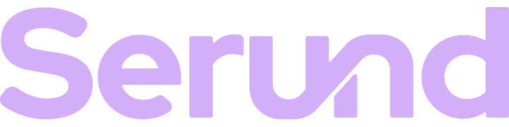
An identity for a family memory platform: a wordmark where one letter continues another
The idea of “continuing each other”: the curve of the u becomes the curve of the n. Each letter keeps its own character, but one line joins them, like one person’s story becoming part of what the whole family knows.
View case: Serund -
An identity for Korean chicken wings delivery: a chicken drawn from the taegeuk and a pattern of the flag’s trigrams
The starting point is the name itself. In Korean, fried chicken is literally 프라이드 치킨, “peuraideu chikin”. We gave the name back its Korean spelling, which sits next to the logo on every touchpoint.
View case: Fried Chicken -
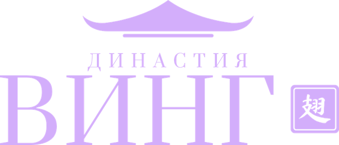
An identity for a Chinese restaurant: a pagoda roof, a classic serif and a master’s seal with the character for “wing”
The main image is a pagoda roof. The eaves curve up so their ends resemble wing tips: one line speaks of China and of the signature dish.
View case: Dynasty Wing -
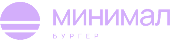
An identity for a premium burger restaurant: a burger reduced to a circle and two lines
The symbol is a burger reduced to the minimum: a circle cut by two lines into bun, patty and bun. It’s recognisable at a glance and needs no extra detail.
View case: Minimal Burger -
An identity for an affordable burger joint: a «Й» crowned with a bun and a style that simply makes you smile
We wrote the name in Cyrillic, big and slanted: «КАЙФ» sounds louder than the Latin spelling and conveys the mood at once.
View case: KaifBurger -
An Italian Art Nouveau identity for a pizzeria: an original tondo illustration, packaging and touchpoints
The name suggested the concept. A tondo is a round Renaissance painting, so the identity centres on its own tondo: a mother and child with pizza, as in classic Italian subjects, framed by a wreath of tomatoes and flowers.
View case: Tondo Pizza -
A brand for an online Japanese restaurant with a Shiba mascot: a character recognised by its smile alone
We created the brand’s hero, a smiling Shiba Inu. The Shiba is one of Japan’s symbols, and its squinting smile sets the tone straight away: friendly, witty and unpretentious.
View case: Michiko -
An identity for an online pan-Asian restaurant: lively lettering, a stack of bowls and six patterns
The logo is lively lettering based on CoFo Chimera: the letters dance like the signs of street cafés but stay legible.
View case: Yugo-Vostok -
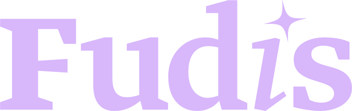
A brand for a tech-driven food delivery service: calm confidence instead of shouting
The logo is set in Greta, a text serif: the serifs signal reliability, and the italic i with a star is the moment of joy when the order arrives.
View case: Fudis
Other services
- Websites and appsCorporate websites, online stores, web services and MVPs. We design the interface, build the product and connect the integrations it needs.
- Automation and AIWe connect services and data and automate repetitive tasks. We build bots, AI assistants and internal tools for business.
- Marketing and acquisitionWe research demand, prepare an SEO strategy, launch advertising and set up analytics. We help you see which channels bring in enquiries.
- Content and communicationsWe develop ideas and create copy, graphics, photo and video for websites, advertising and social media.
- CybersecurityWe test the security of websites and infrastructure, fix vulnerabilities and build up your defences. We start with a free passive audit.
What shall we build together?
Tell us what you want to launch or improve. We’ll discuss the task and suggest the next step.