Michiko
A brand for an online Japanese restaurant with a Shiba mascot: a character recognised by its smile alone

Task
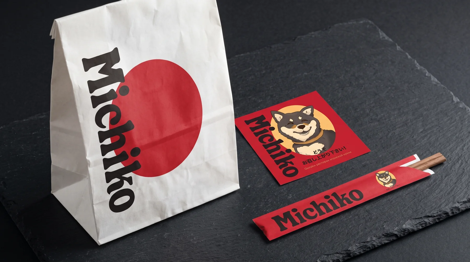
Michiko delivers Japanese food. There are plenty of competitors, and almost all use the same symbols: characters, cherry blossom, waves. The brand needed character, warm and memorable, so an order from Michiko is recognised at first glance, before the bag is even opened.
Solution
- We created the brand’s hero, a smiling Shiba Inu. The Shiba is one of Japan’s symbols, and its squinting smile sets the tone straight away: friendly, witty and unpretentious.
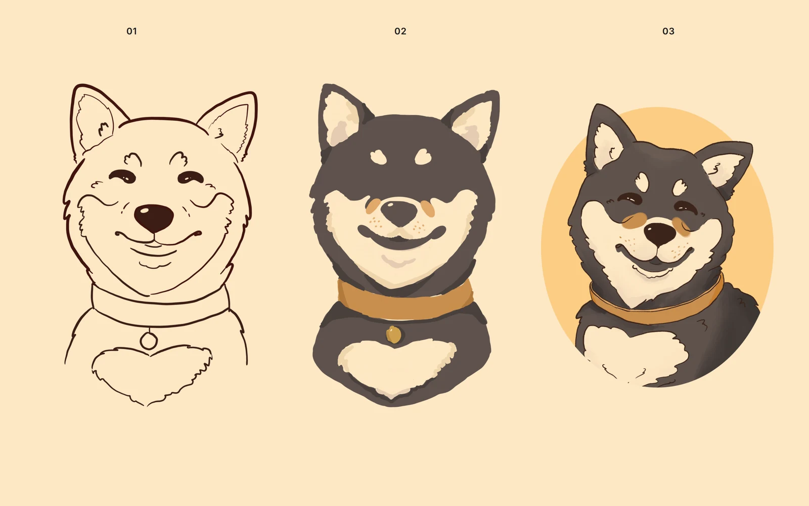
- We drew the mascot with an illustrator from sketch to final portrait, working out the expression, proportions and character, then the colour and fur texture.
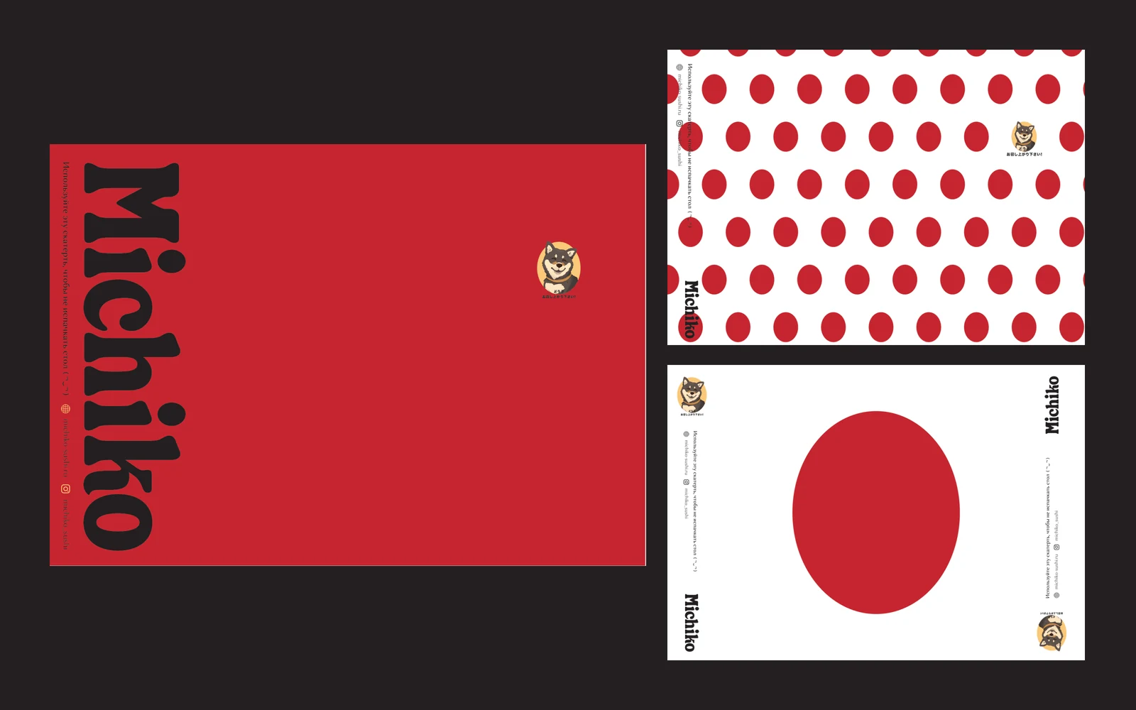
- The graphic system is built on the hinomaru, the red circle of the Japanese flag, and polka dots: simple shapes that are recognisable from afar and scale easily from tape to bag.
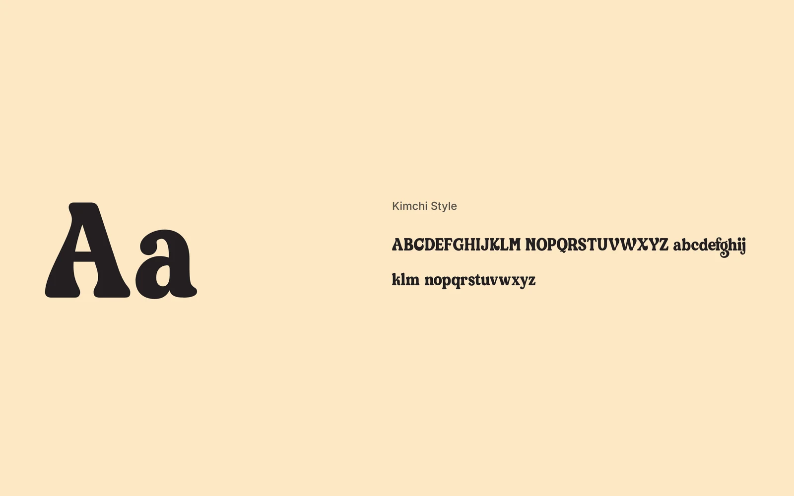
- The logo is set in Kimchi Style, a dense typeface with soft serifs that is heavy and warm at once, just like the brand.
- On the sticker the mascot greets guests in Japanese: “Please, enjoy your meal!”
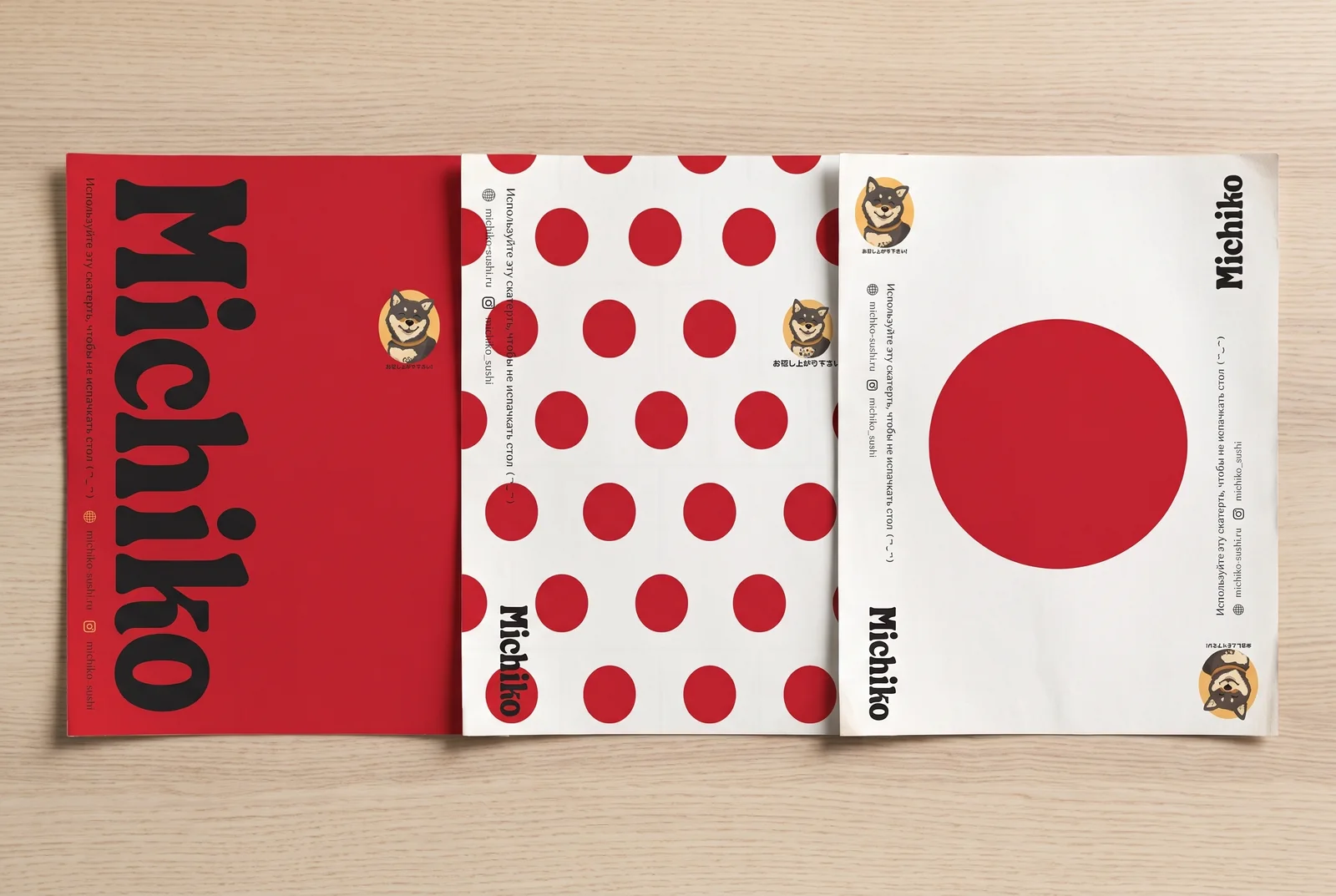
- Touchpoints: bags in two sizes, stickers, two kinds of tape, chopstick sleeves and three paper tray liners.
Identity
Logo and mascot
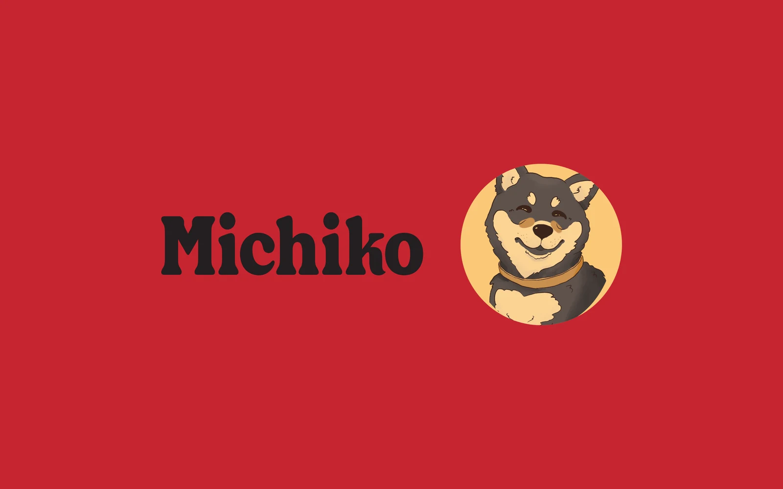
A dense logo on Japanese red and a Shiba portrait in an apricot circle. The mascot works as a second logo, recognisable even without the name.
Colours
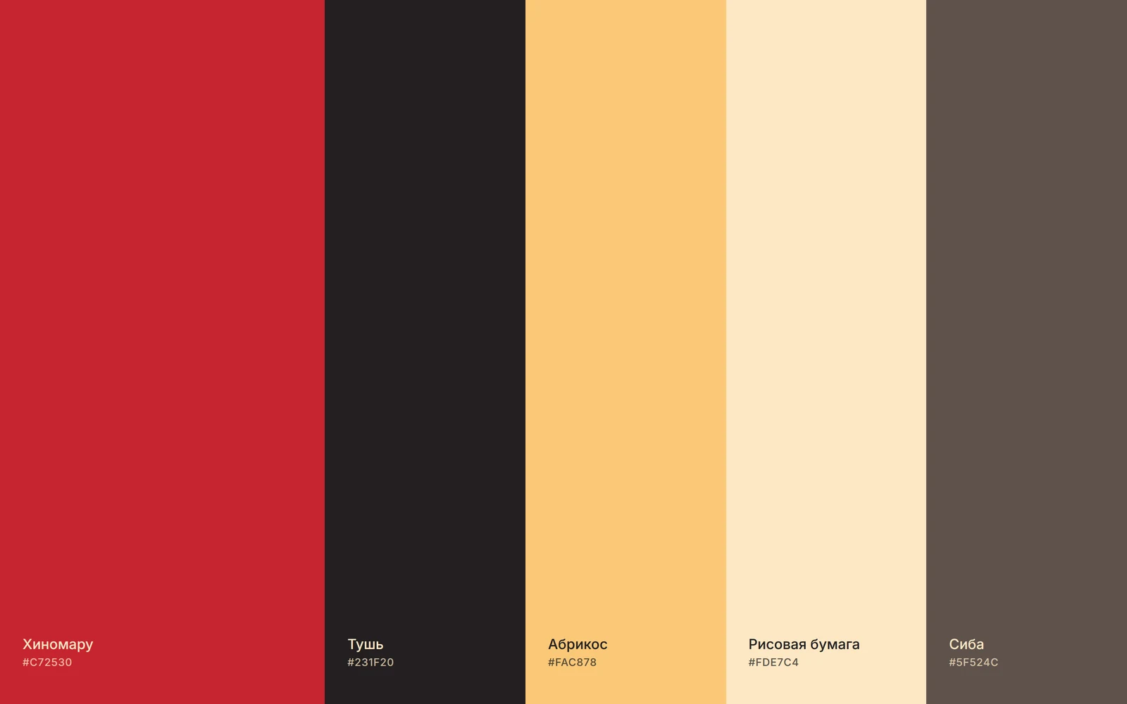
Hinomaru red and ink black form the base. Apricot and rice paper soften the contrast and make the brand warm, while the Shiba’s chocolate fur ties the palette to the mascot.
Typeface
Kimchi Style is dense, with soft teardrop serifs. It speaks loudly without being aggressive and holds up on small items such as chopstick sleeves.
Drawing the mascot
A line sketch, the first colour version and the final portrait. In between were dozens of versions of the eyes, ears and smile: the Shiba had to look happy rather than sly.
Graphic system
Three patterns for tray liners and packaging: a red background with a large logo, polka dots and the hinomaru. They combine freely, so everything on the tray tells one story.
Touchpoints
Three tray liners 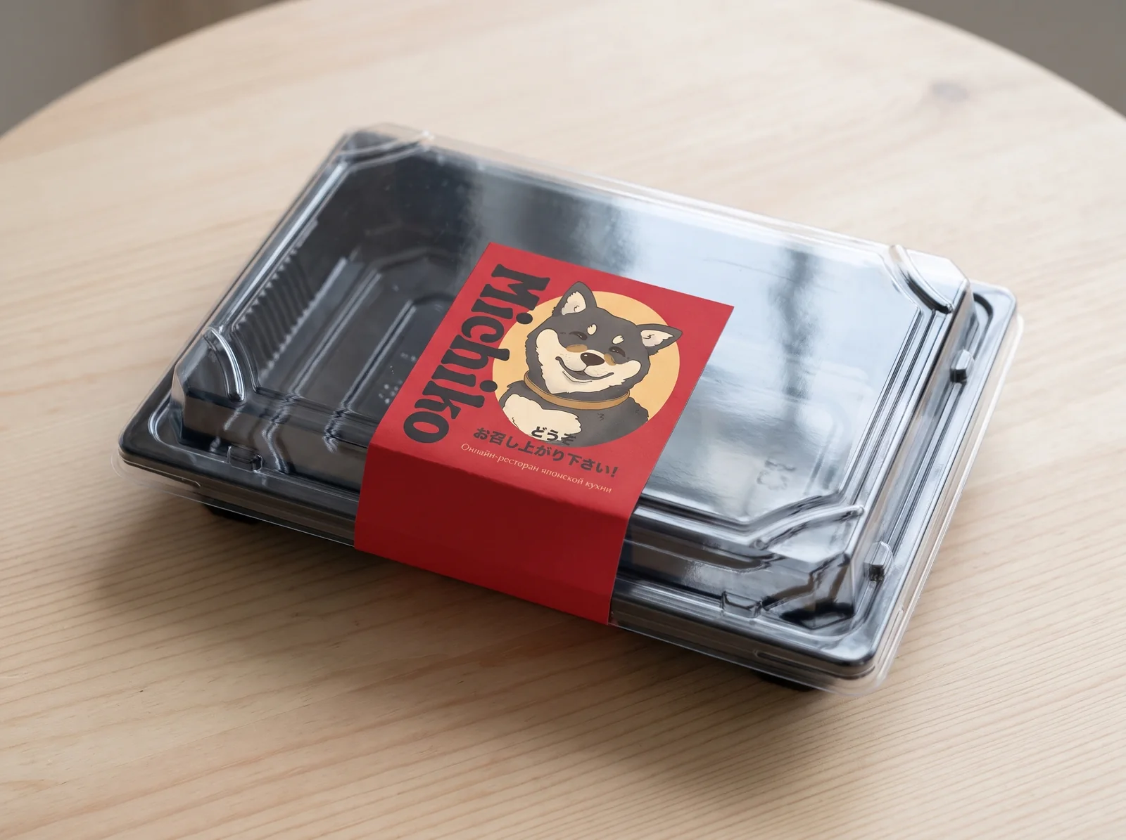
A packaging sticker 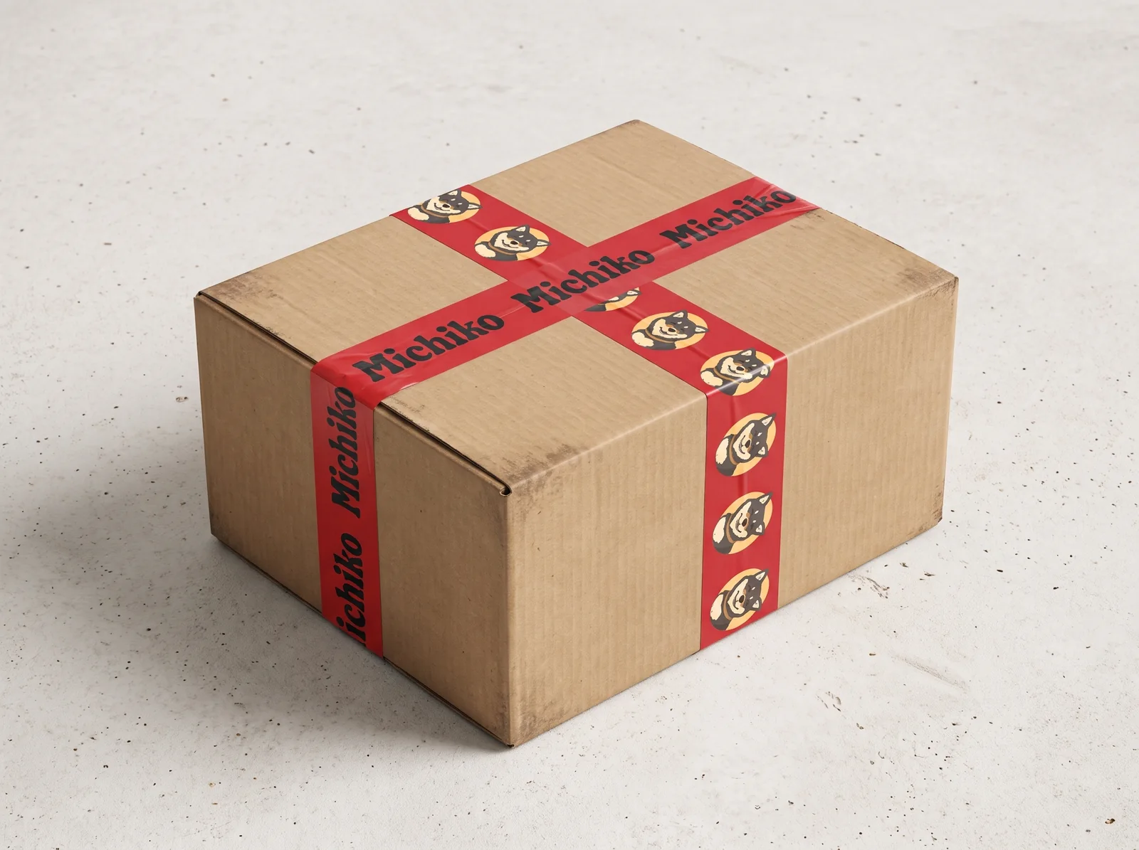
Branded tape 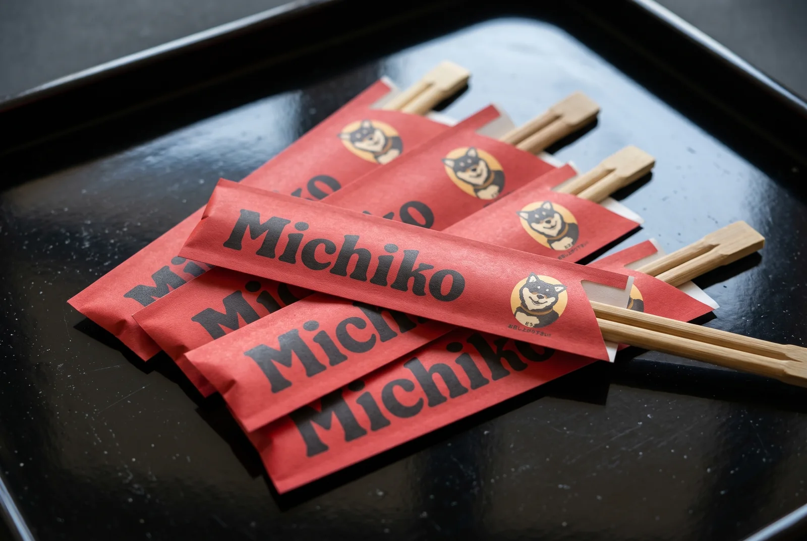
Chopstick sleeves 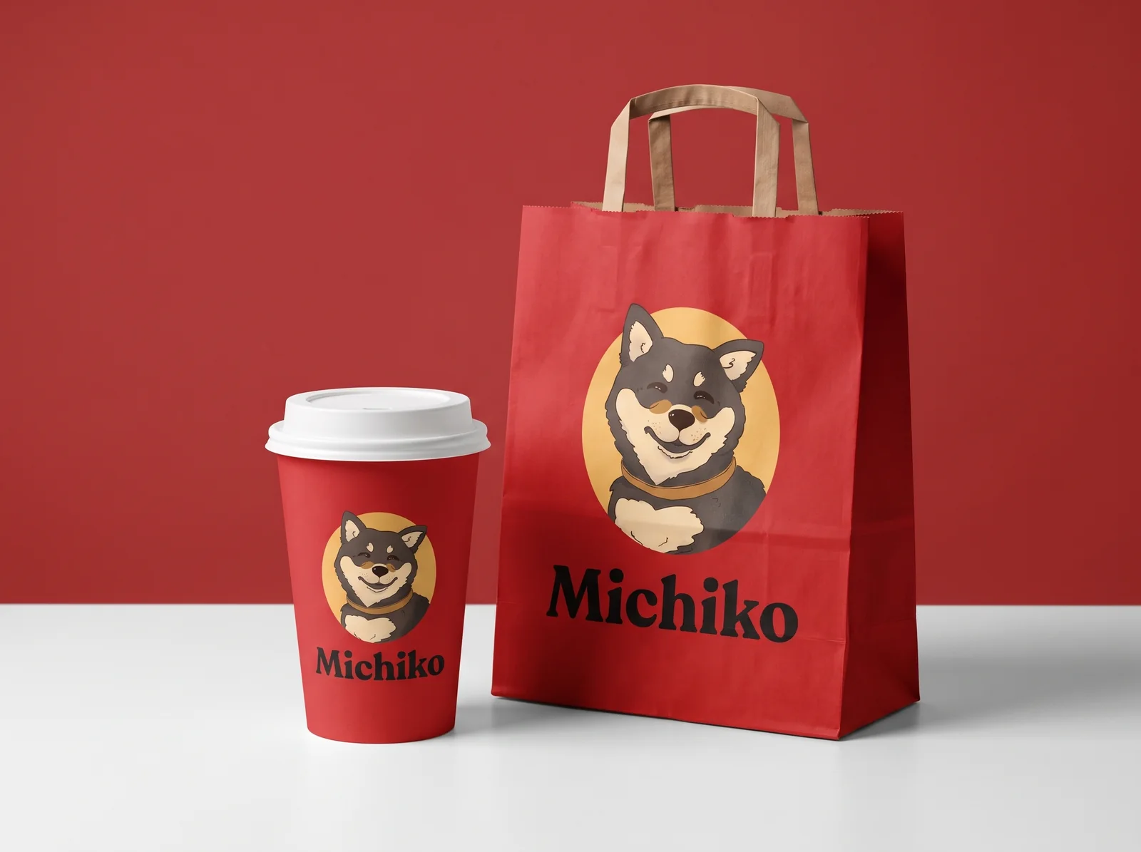
Cup and bag
What shall we build together?
Tell us what you want to launch or improve. We’ll discuss the task and suggest the next step.