Fried Chicken
An identity for Korean chicken wings delivery: a chicken drawn from the taegeuk and a pattern of the flag’s trigrams
Task
Fried Chicken makes Korean-style wings: crunchy, in spicy and soy glazes. Korean fried chicken is a food culture of its own, and the brand had to say “Korea” at once without postcard clichés. It also had to feel friendly: people order it for an evening with friends, not a business lunch.
Solution
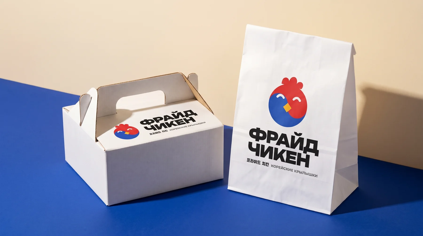
- The starting point is the name itself. In Korean, fried chicken is literally 프라이드 치킨, “peuraideu chikin”. We gave the name back its Korean spelling, which sits next to the logo on every touchpoint.
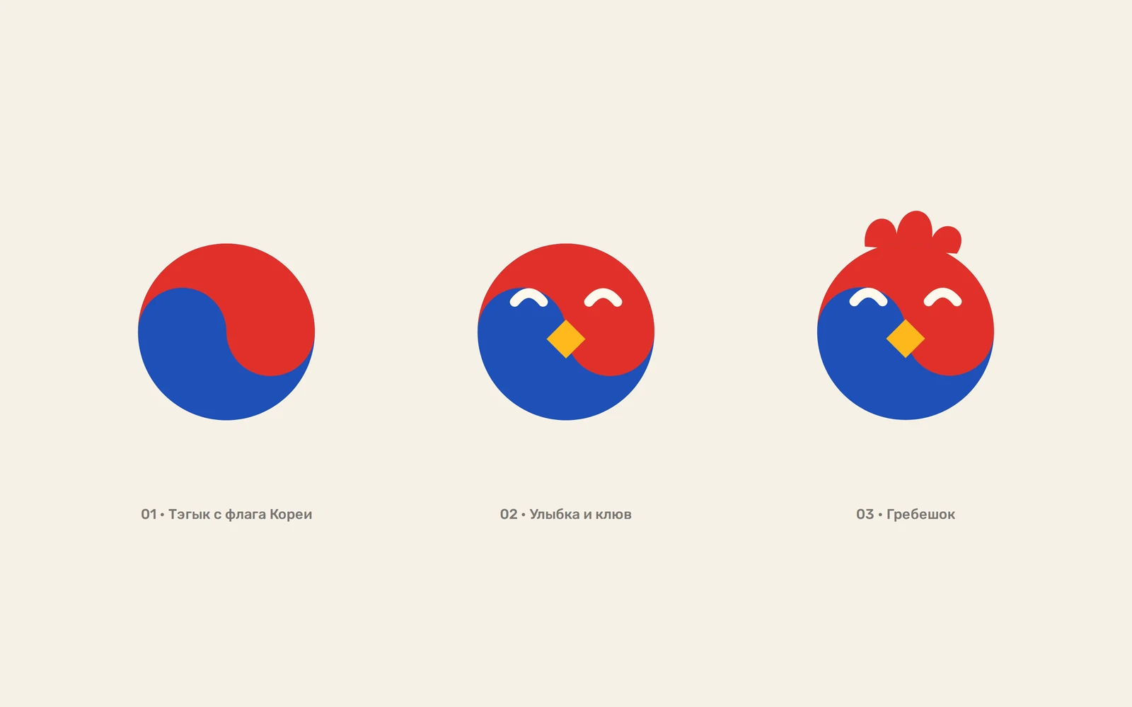
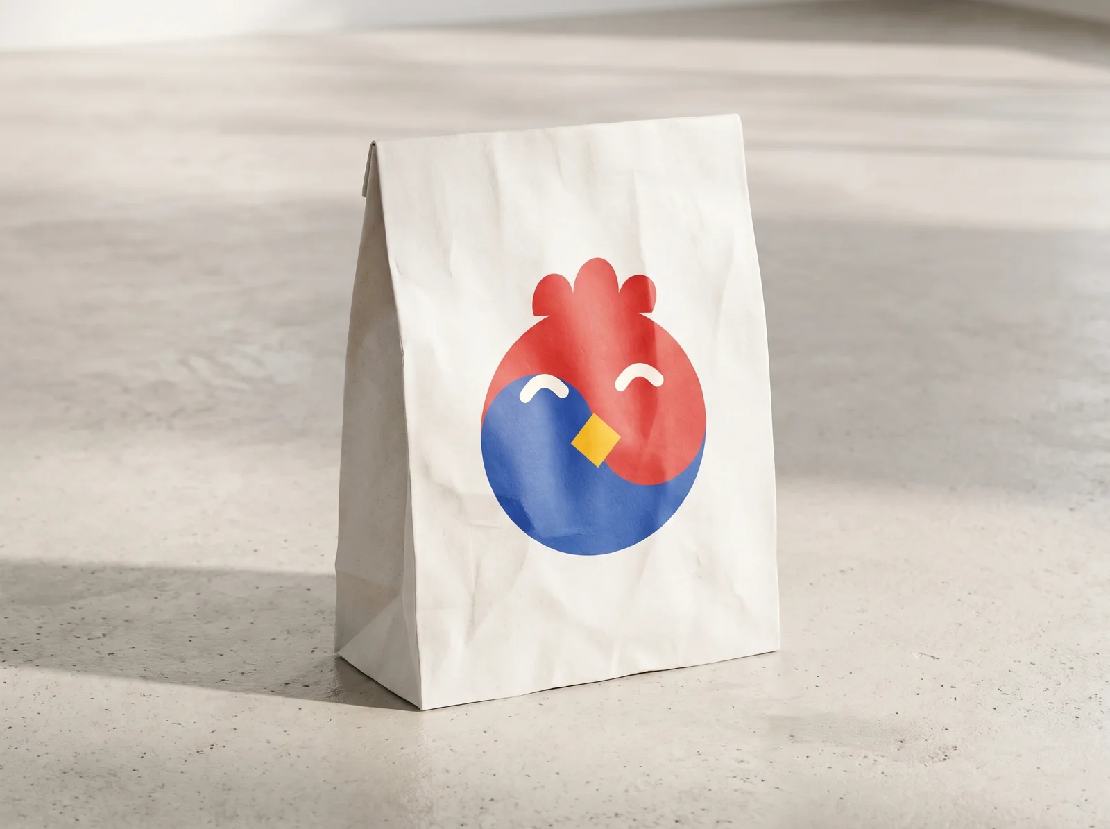
- The symbol is built from Korea’s main emblem, the taegeuk from the flag: the red-and-blue circle became a chicken with squinting smiling eyes, a beak and a comb. It reads both as the flag and as a character.
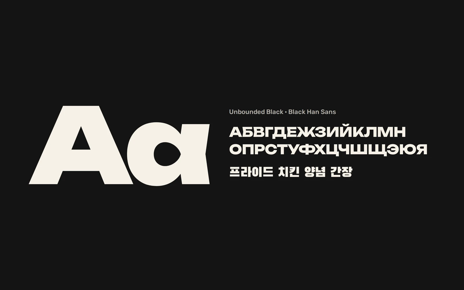
- The wordmark is set in the wide Unbounded Black, dense and loud like the signs of Korean chicken bars, with the hangul in Black Han Sans.
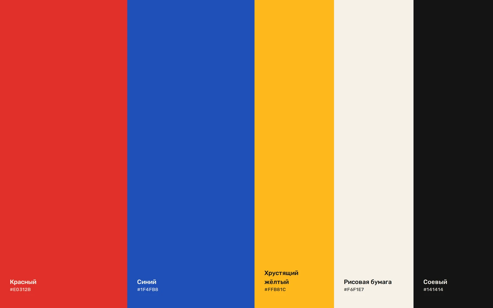
- The palette takes the flag’s colours to appetising shades: juicy red, deep blue, crunchy yellow, rice paper and soy black.
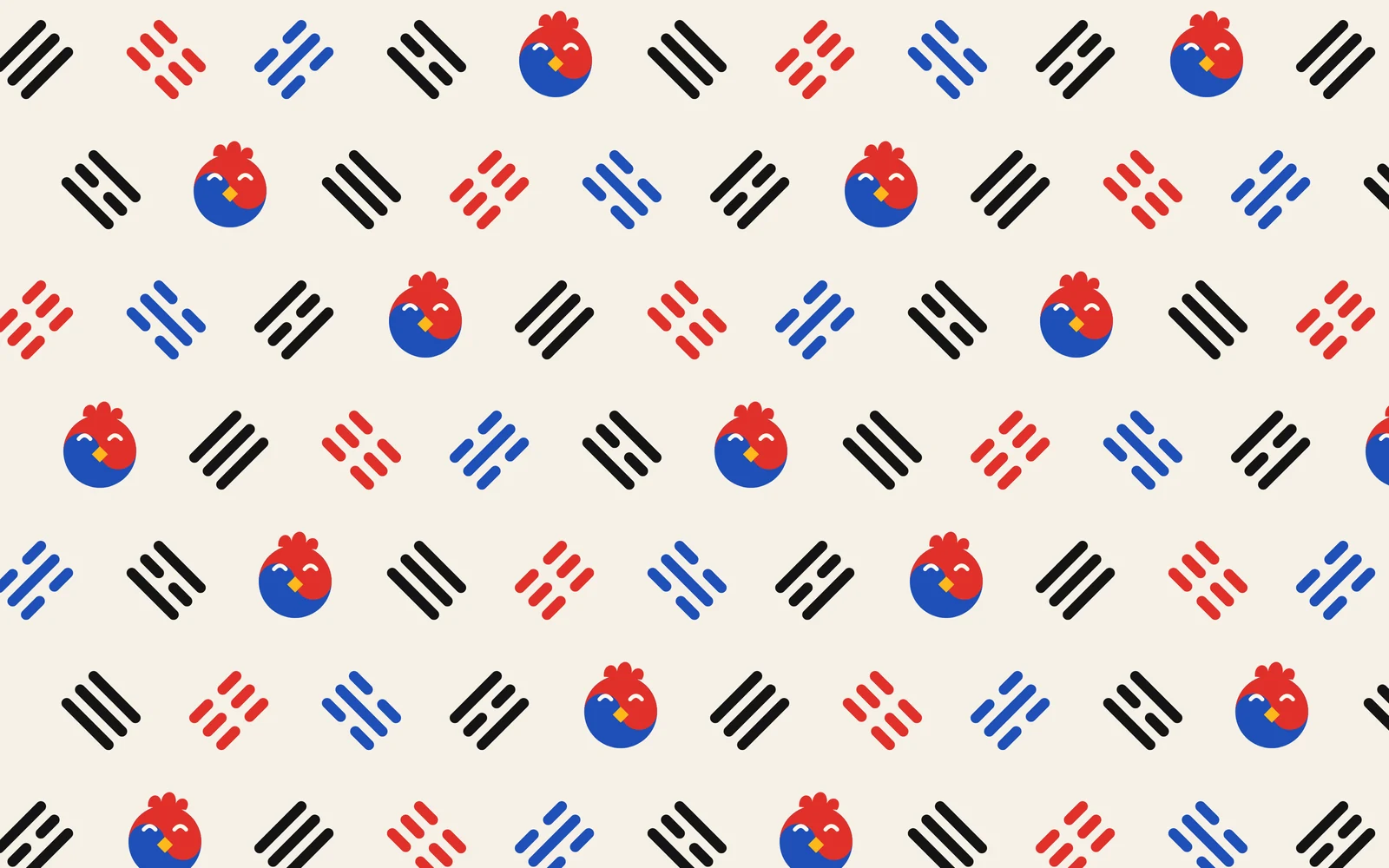
- The flag’s four trigrams became a pattern: together with small chickens they decorate boxes, bags and merch.
- Touchpoints: chicken boxes, bags, cups and sauce pots, stickers, a sign and staff uniforms.
Identity
Logo
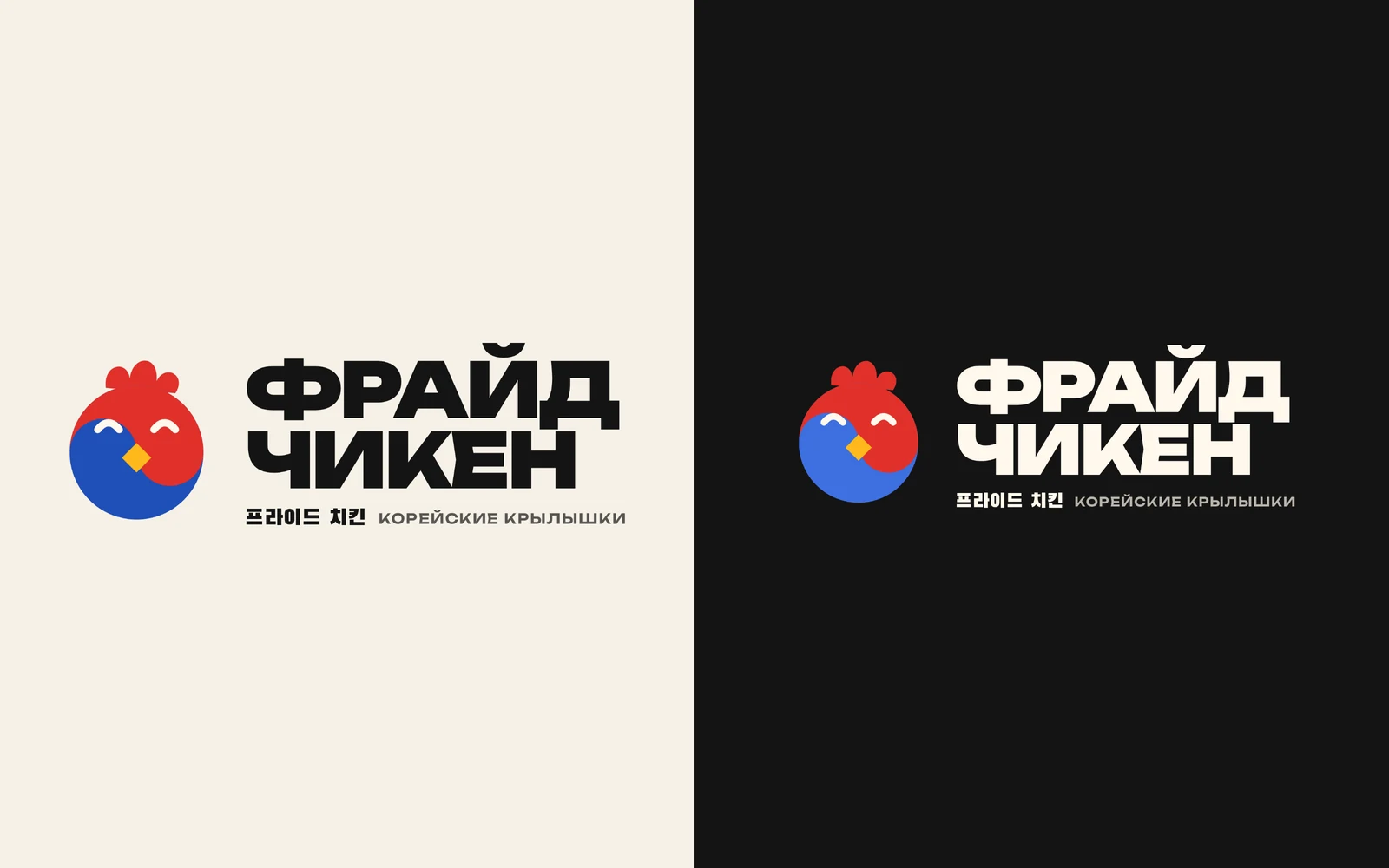
The chicken symbol, a dense wide wordmark and the Korean line 프라이드 치킨. It works on light and dark backgrounds and in a single colour.
How the symbol works
The taegeuk from the flag, then squinting eyes and a beak, then the comb. Three steps turn a national emblem into a character you’d trust with dinner.
Colours
Red and blue from the flag, yellow as the colour of the crispy crust. Rice paper instead of white makes the packaging warm, and soy black carries the text.
Typefaces
Unbounded Black for the wordmark and headlines, Black Han Sans for the Korean lines. Both are wide and dense, so Cyrillic and hangul sit side by side as one.
Pattern
The flag’s four trigrams (heaven, earth, water and fire) in brand colours, with chickens in between. The pattern covers boxes, bags and stickers.
Touchpoints
Bag 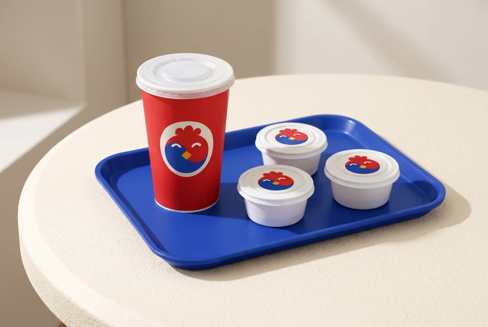
Cup and sauce pots 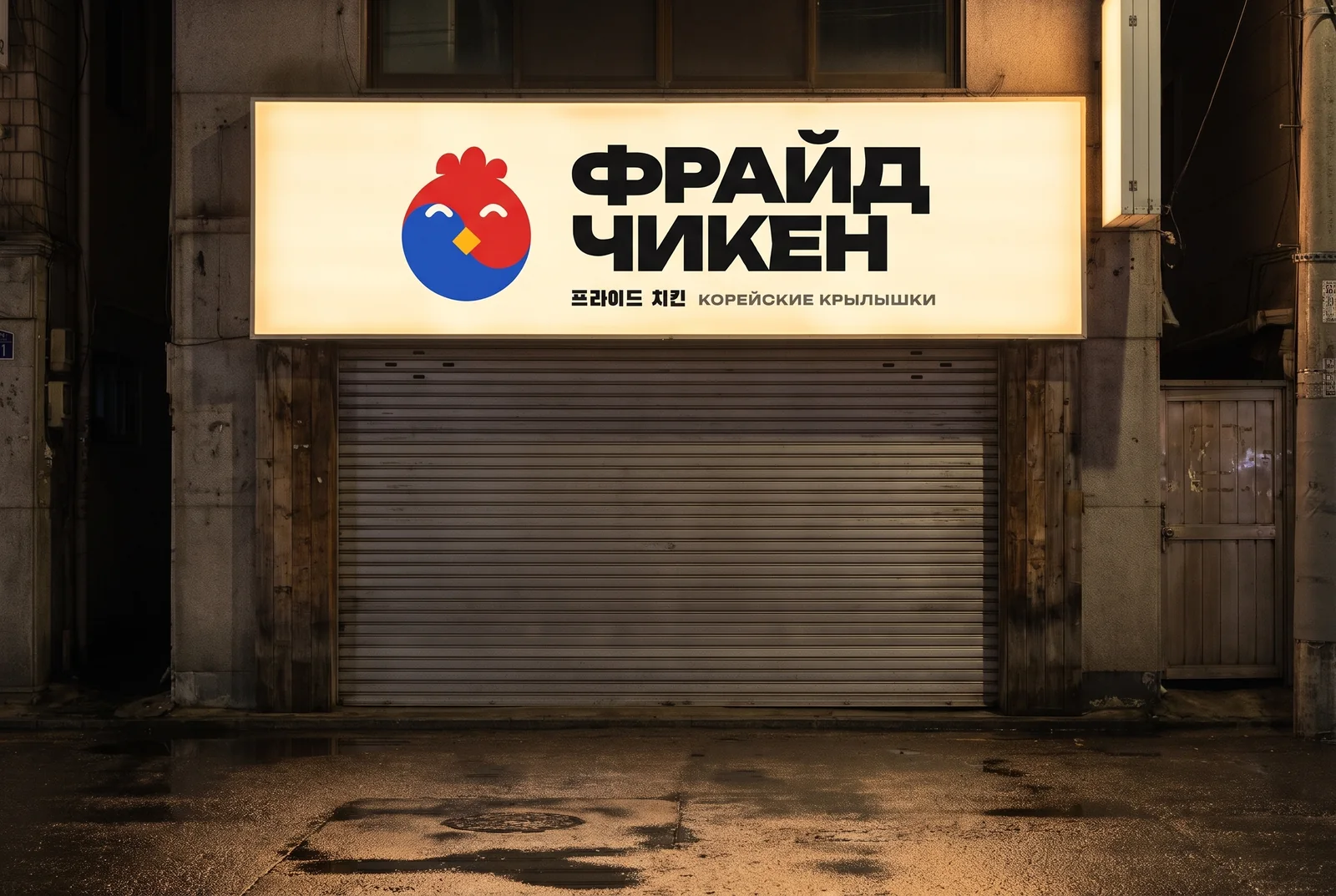
Sign 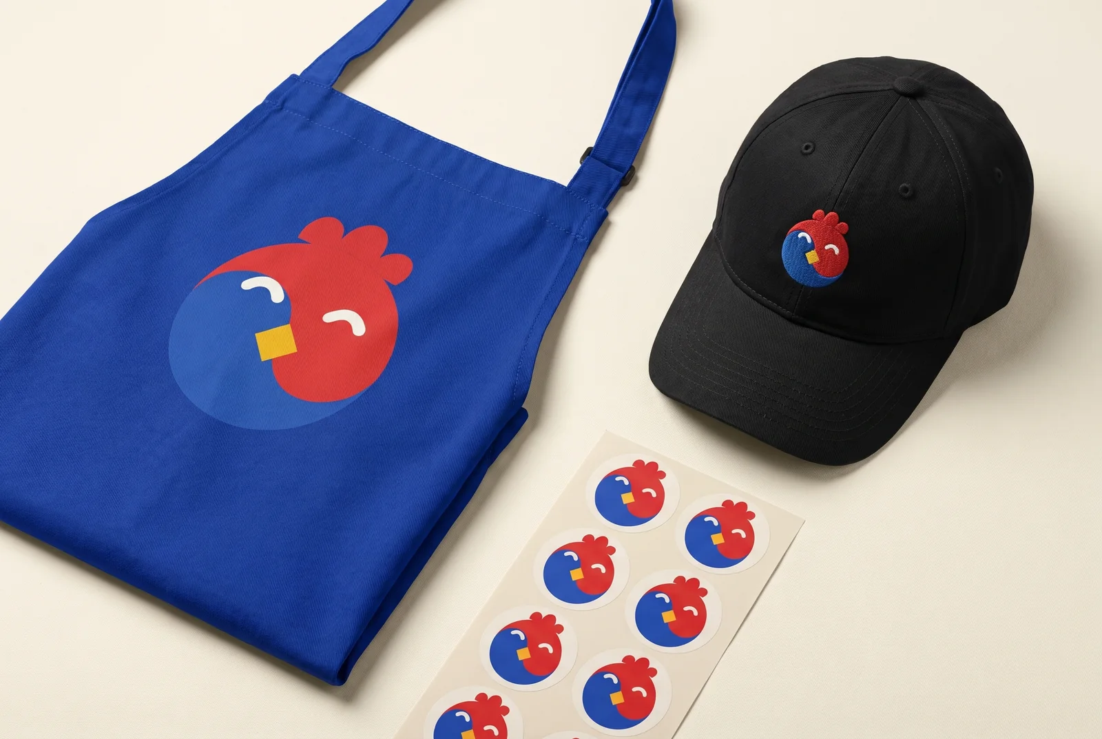
Uniform and stickers
Related services
-
Logo design services
A logo is the way your name is written, or the symbol, that people recognise on a sign, on packaging, in an app icon and in a social media feed.
-
Brand identity design and brand book
A brand identity, or corporate identity, is the set of visual elements and rules that make a brand recognisable on any touchpoint: logo, colours, typefaces, graphics and illustration.
-
Packaging design
Packaging design isn’t one beautiful box but a system of touchpoints that makes an order recognisable before anyone opens it: boxes, bags, stickers, tape, cups, tray liners and menus.
What shall we build together?
Tell us what you want to launch or improve. We’ll discuss the task and suggest the next step.