KaifBurger
An identity for an affordable burger joint: a «Й» crowned with a bun and a style that simply makes you smile
Task
KaifBurger makes everyday burgers: fast, filling and affordable. The brand had to sound like its name, “kaif” being Russian slang for pure pleasure: fun, loud and down-to-earth, standing out in a food court and in a delivery app while staying simple enough for any packaging, from a cup to a sign.
Solution
- We wrote the name in Cyrillic, big and slanted: «КАЙФ» sounds louder than the Latin spelling and conveys the mood at once.
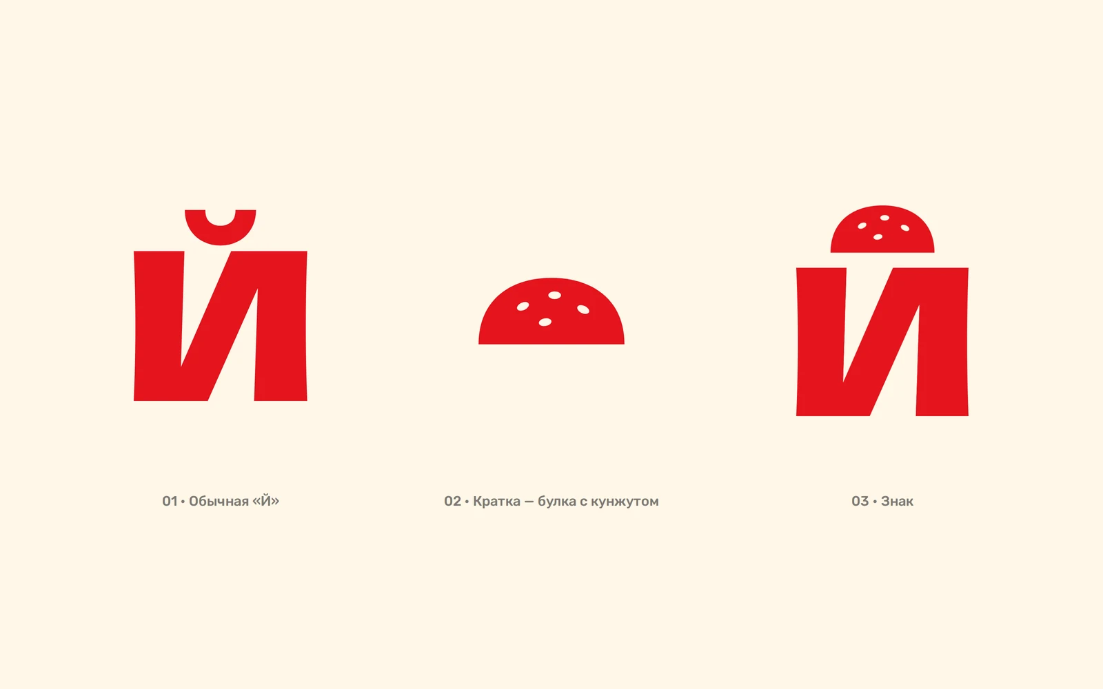
- The key idea: the breve over «Й» became a sesame bun top. One detail turns the word into a logo and the letter into a standalone symbol.
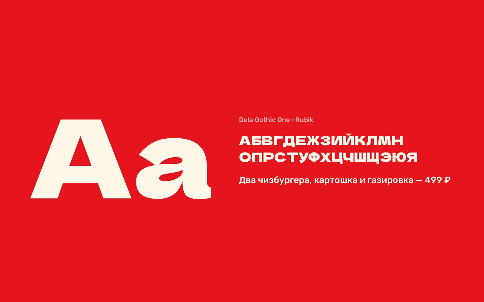
- Dela Gothic One is bold and characterful, with full Cyrillic. The −5° tilt adds movement, as in the original handwritten logo.
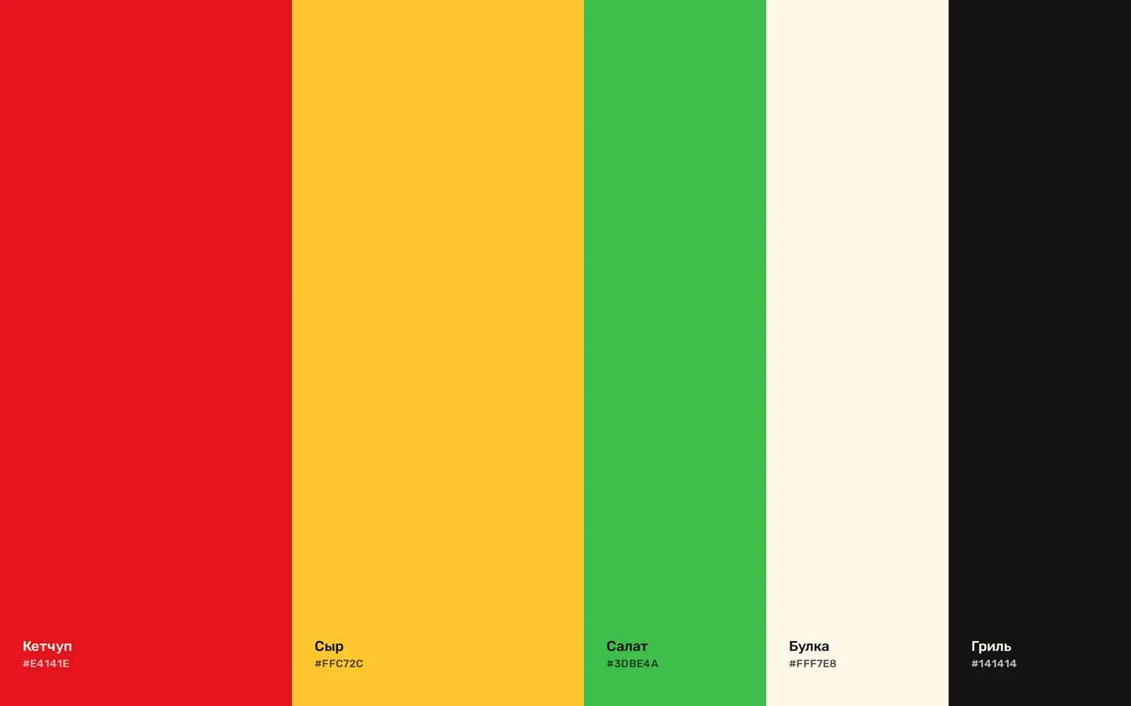
- The palette comes from the burger itself: ketchup, cheese, lettuce, bun and grill. Red and yellow work as a pair and swap places across touchpoints.
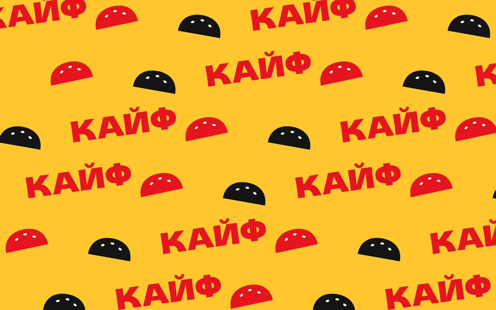
- A pattern of buns and the word «КАЙФ» at different angles, for packaging, stickers and social media.
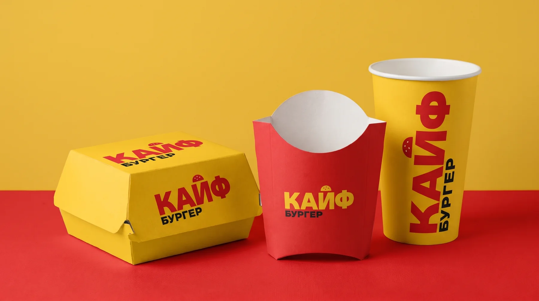
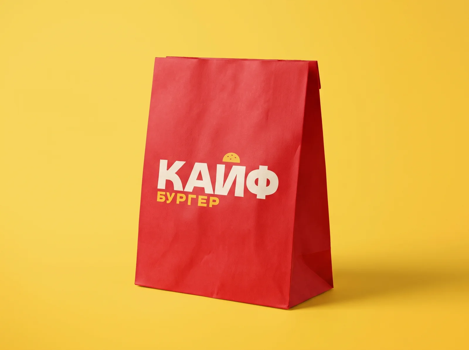
- Touchpoints: boxes, fries cartons, cups, bags, stickers, staff uniforms and a kiosk sign.
Identity
Logo
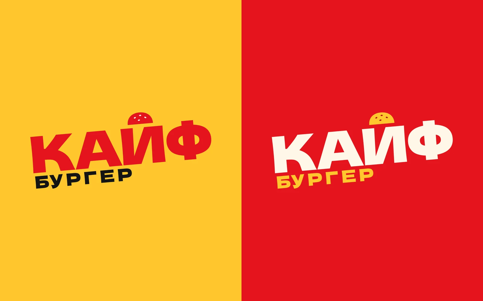
A bold «КАЙФ» with a bun instead of a breve and «БУРГЕР» below. Red on yellow, cream and yellow on red.
How the symbol works
An ordinary «Й», a sesame-bun breve and a symbol that works on its own: on stickers, the app icon and the avatar.
Colours
Ketchup and cheese are the main pair, lettuce is a fresh accent, and bun and grill serve as backgrounds and text.
Typefaces
Dela Gothic One for the logo and headlines, Rubik for the menu, prices and labels.
Pattern
Buns and «КАЙФ» scattered like stickers on a laptop. The pattern fills the packaging and makes it recognisable even without the logo.
Touchpoints
Bag 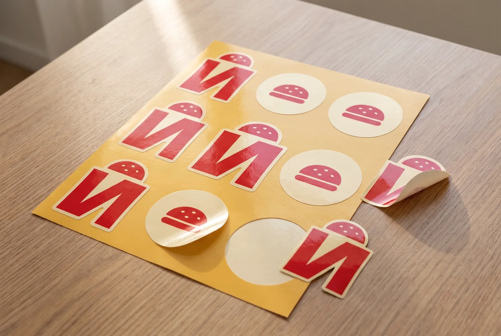
Stickers 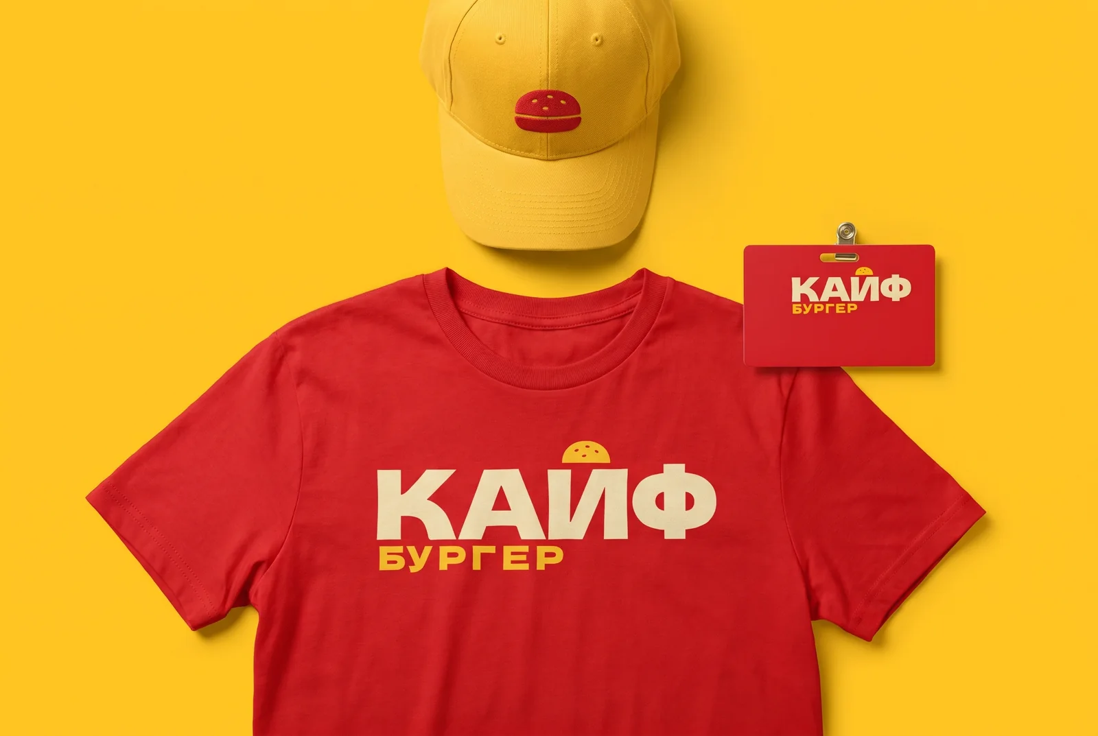
Staff uniform 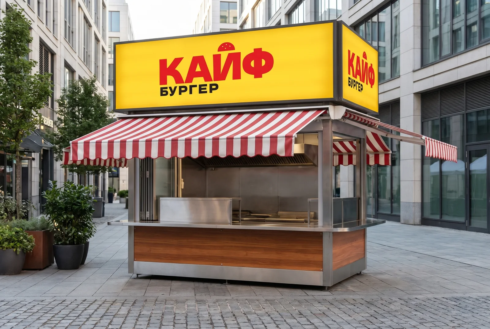
Kiosk sign
Related services
-
Logo design services
A logo is the way your name is written, or the symbol, that people recognise on a sign, on packaging, in an app icon and in a social media feed.
-
Packaging design
Packaging design isn’t one beautiful box but a system of touchpoints that makes an order recognisable before anyone opens it: boxes, bags, stickers, tape, cups, tray liners and menus.
What shall we build together?
Tell us what you want to launch or improve. We’ll discuss the task and suggest the next step.