Yugo-Vostok
An identity for an online pan-Asian restaurant: lively lettering, a stack of bowls and six patterns

Task
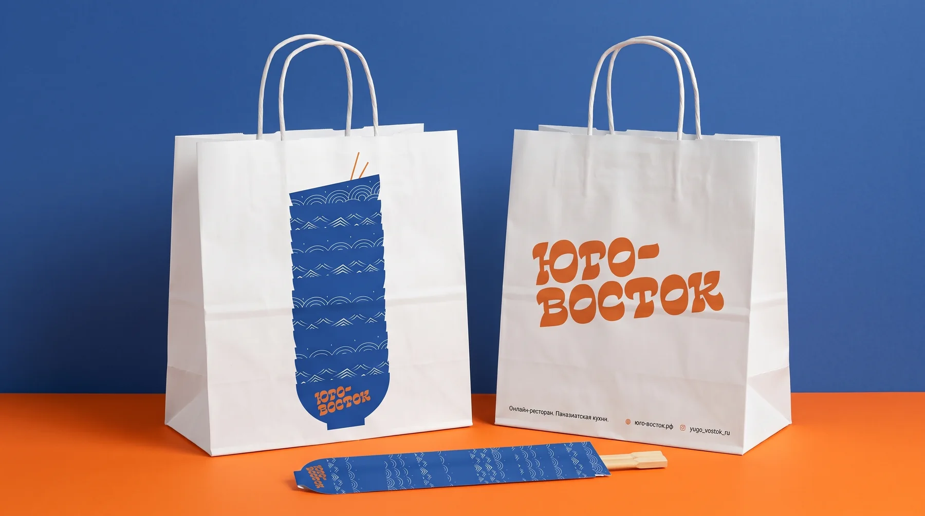
Yugo-Vostok (“South-East”) delivers pan-Asian food: noodles, soups, wok dishes and dumplings. The name is direct and a little ironic, and the style had to match it: bright, with the energy of Asian street food, but without tired dragons or pseudo-oriental Cyrillic.
Solution
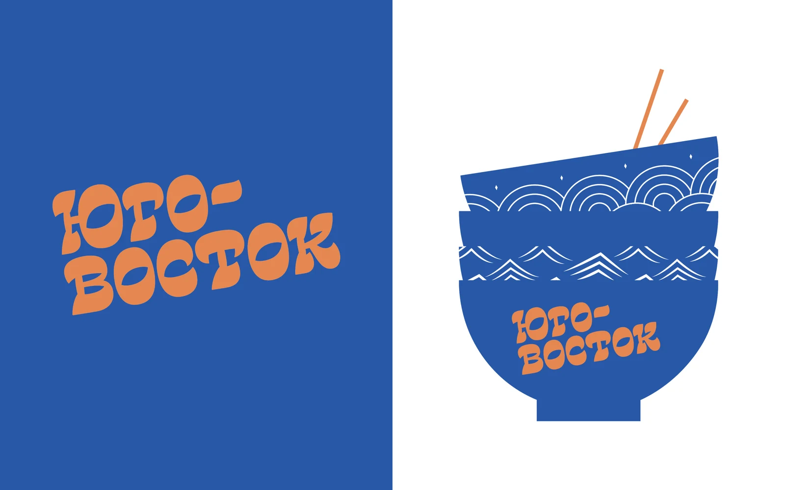
- The logo is lively lettering based on CoFo Chimera: the letters dance like the signs of street cafés but stay legible.
- The main symbol is a stack of bowls with chopsticks. Each bowl has its own ornament, and together they form a recognisable silhouette that works as both a logo and an illustration.
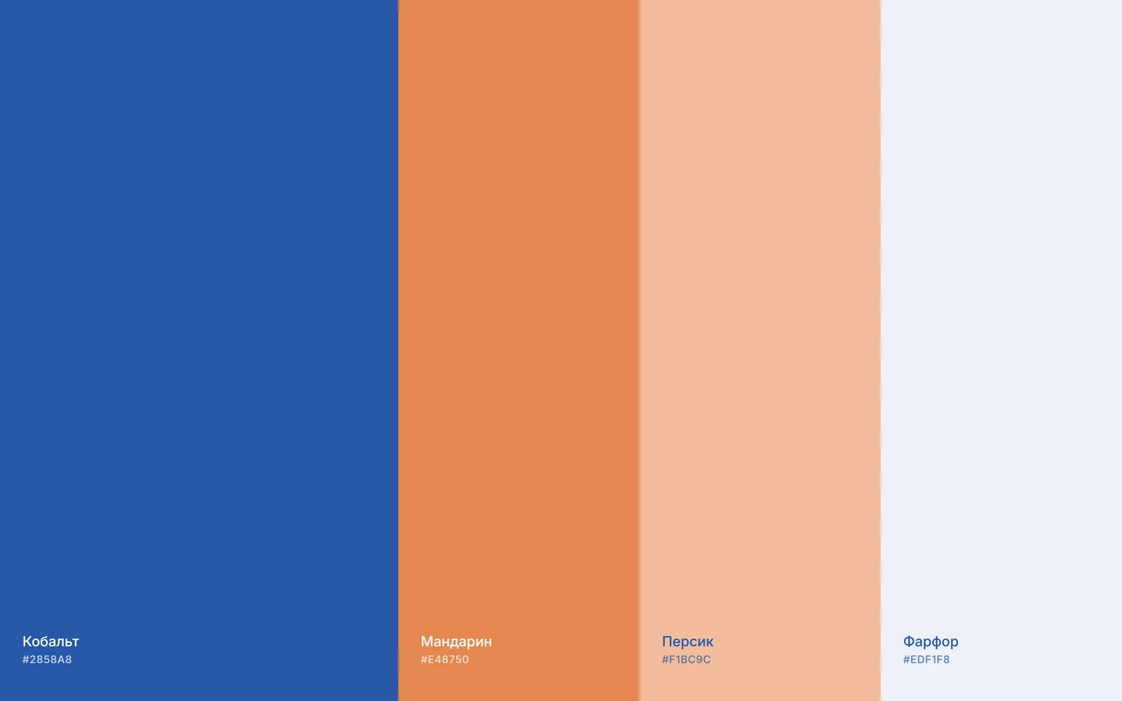
- A contrasting palette: the cobalt of porcelain tableware and tangerine orange. Bright yet easy on the eye, and it holds up well in print.
- We designed six patterns based on Asian ornaments, including seigaiha waves, diamonds and woven motifs. They decorate the menu, tray liners, chopstick sleeves and packaging.
- Touchpoints: bags in two formats, stickers, two kinds of tape, three chopstick sleeve designs, a paper tray liner and a menu.
Identity
Logo and symbol
Dancing lettering and a stack of bowls with chopsticks. The symbol is recognised by its silhouette, so it works large on a bag and small on a sticker.
Colours
Cobalt and tangerine, a pairing taken from Asian tableware and street signs. Peach and porcelain white serve as backgrounds and menu text.
Typeface
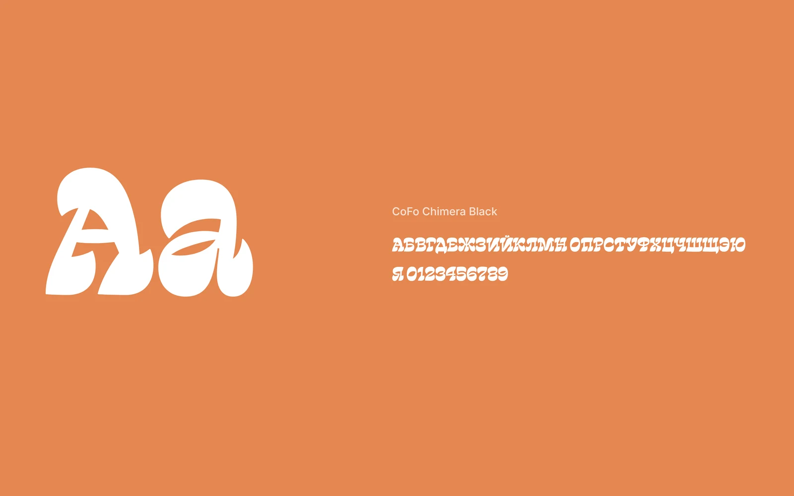
CoFo Chimera Black is soft and heavy, with full Cyrillic. The logo lettering grew out of it, and it works on its own in menu headings.
Patterns
Six ornaments in the two brand colours. They replace photography on the packaging and make every bag and chopstick sleeve slightly different.

Touchpoints as a system
Chopstick sleeves and tape are built from the same elements — bowls, waves and the logo — so the whole order looks like one set.
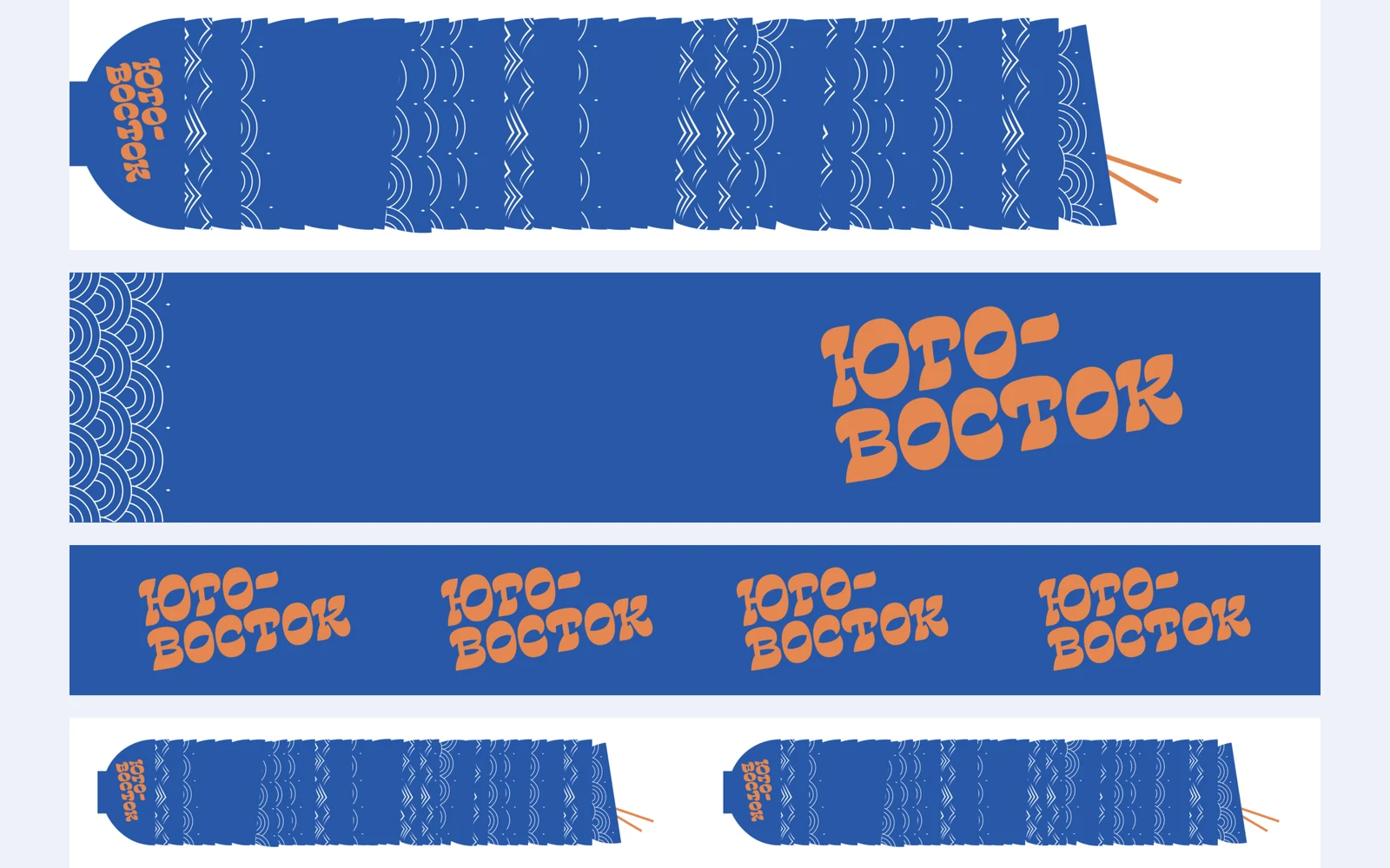
Touchpoints
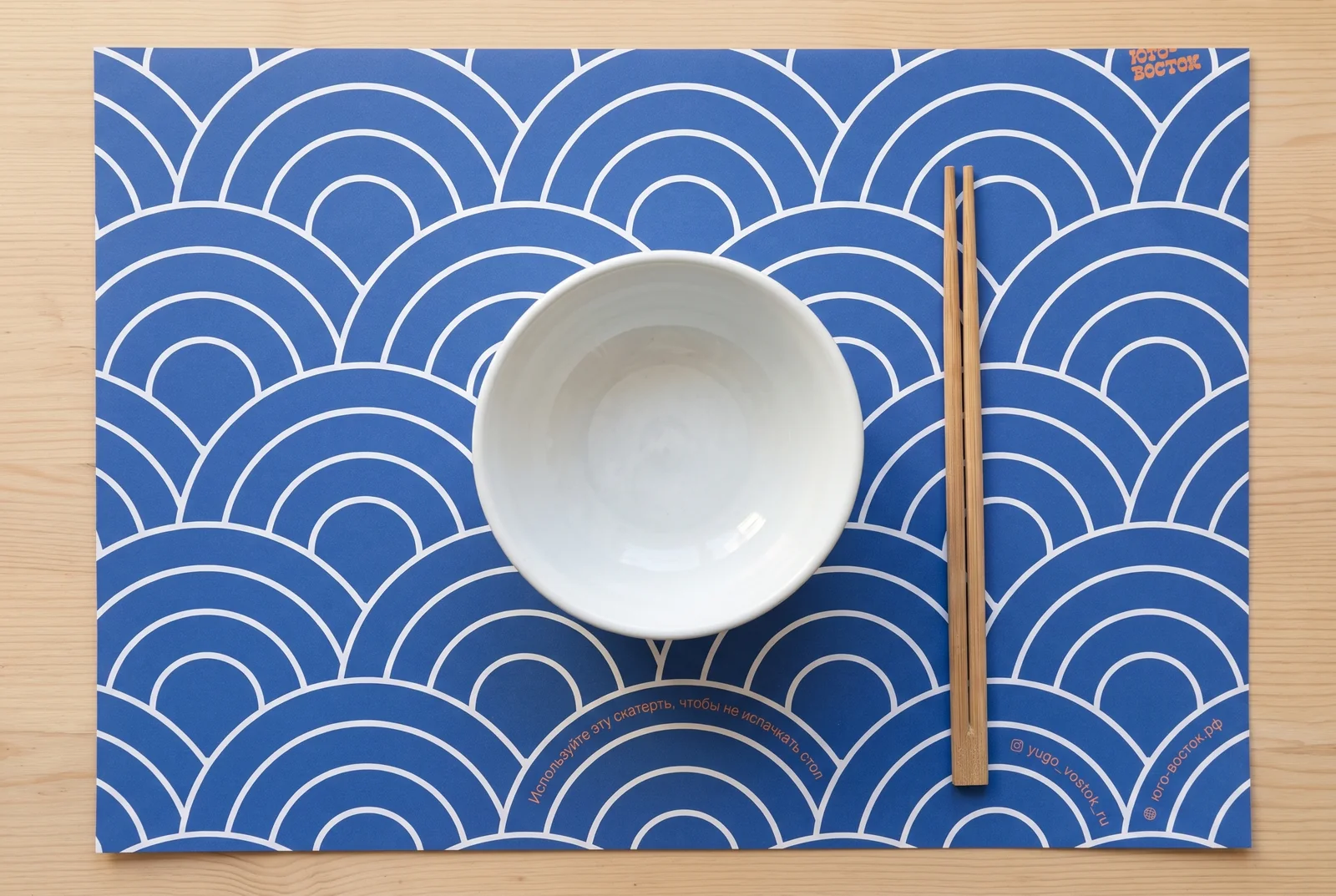
Tray liner 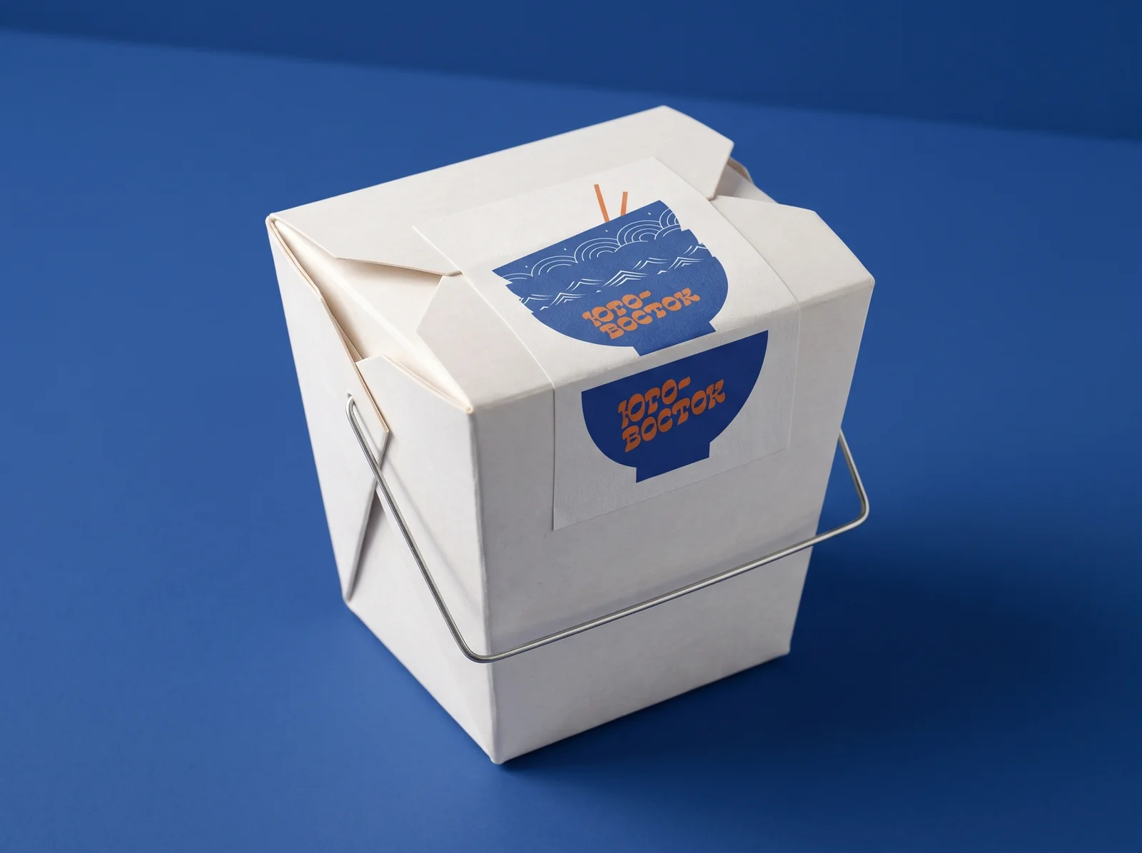
A noodle box sticker 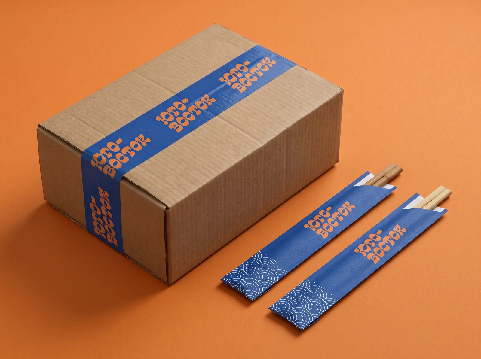
Tape and chopstick sleeves 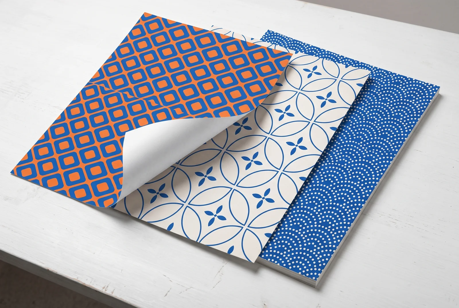
Patterns in print 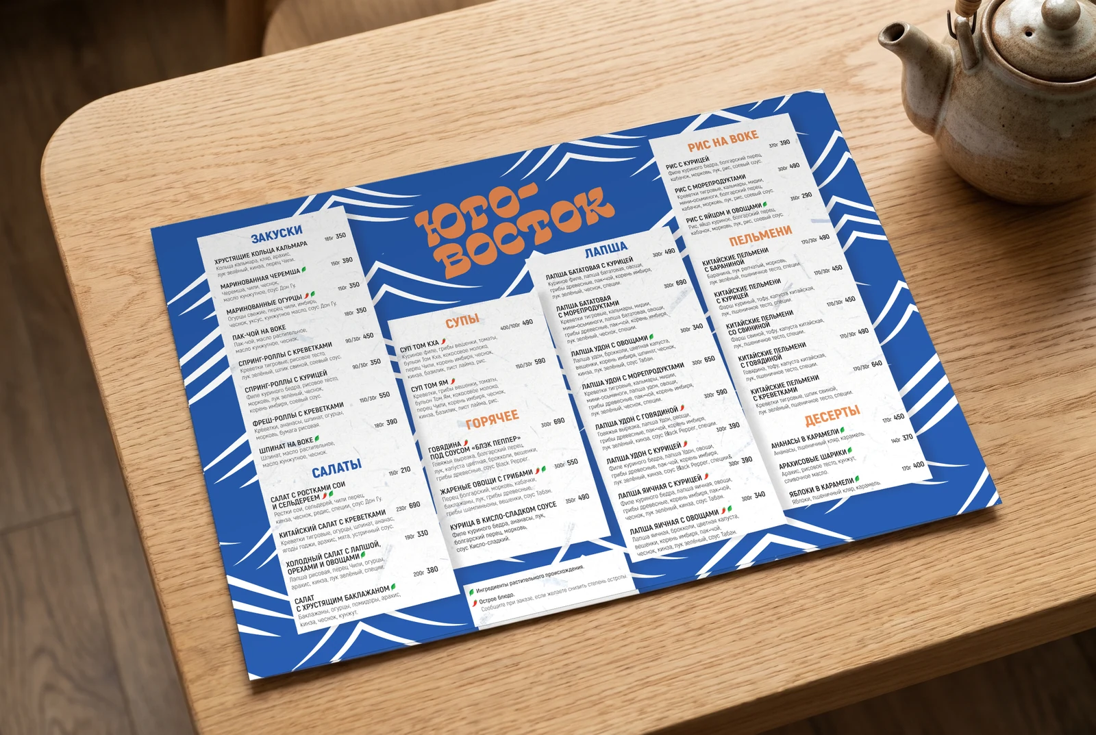
Menu
Related services
-
Brand identity design and brand book
A brand identity, or corporate identity, is the set of visual elements and rules that make a brand recognisable on any touchpoint: logo, colours, typefaces, graphics and illustration.
-
Packaging design
Packaging design isn’t one beautiful box but a system of touchpoints that makes an order recognisable before anyone opens it: boxes, bags, stickers, tape, cups, tray liners and menus.
What shall we build together?
Tell us what you want to launch or improve. We’ll discuss the task and suggest the next step.