Serund
An identity for a family memory platform: a wordmark where one letter continues another
Task
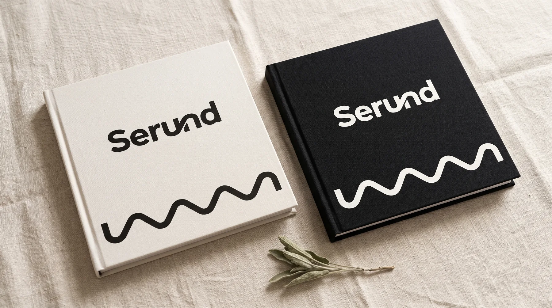
Serund helps families keep their relatives’ stories: an AI companion asks about the past, and the platform gathers the answers into a shared family space. The brand had to convey the core idea, the bond between generations, without tipping into sentimentality: people use the product every day, and the logo has to work equally well as an app icon, on the cover of a family book and in an email header.
Solution
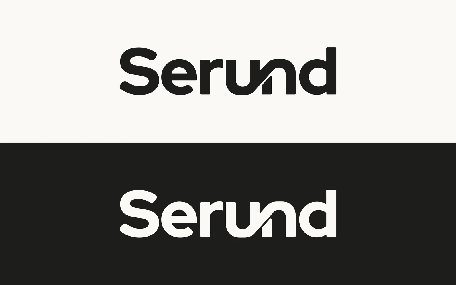
- The idea of “continuing each other”: the curve of the u becomes the curve of the n. Each letter keeps its own character, but one line joins them, like one person’s story becoming part of what the whole family knows.
- The wordmark is built on Red Hat Display: the terminals are softened, and the u–n link is drawn separately from the font’s own bowl quarters, so its weight and curvature match the neighbouring letters.
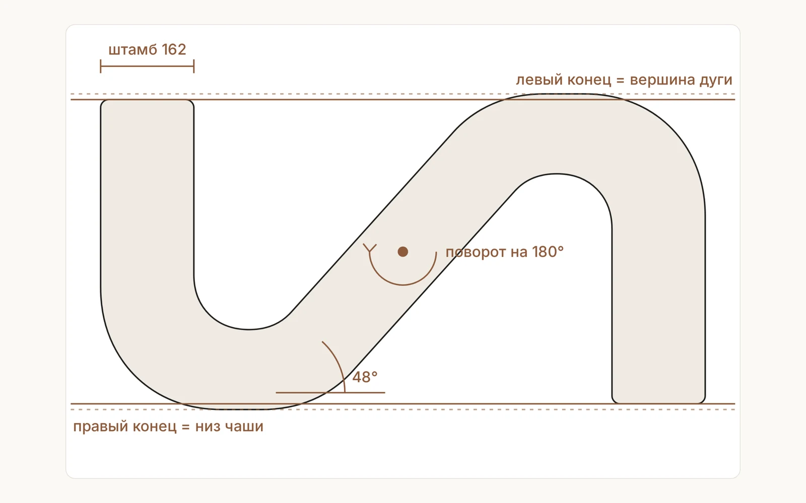
- The symbol is the same link without the inner stubs. It matches itself when rotated 180° and holds up even in a 16-pixel browser icon.
- The symbol, wordmark, icons, banners and pattern are drawn in code from a single geometry: the files rebuild with one command and never drift apart by a pixel.
- The logo lives in just two colours, ink and paper, while the brand’s warmth comes from the warm paper, serif headings, the sage of Vesta’s voice and terracotta around the mark.
- A brand book with rules (clear space, minimum sizes, what not to do with the mark) and a full set of files, from the app icon to link previews.
Identity
Continuing each other
The curve of the u becomes the curve of the n: each letter keeps its character, but one line joins them, the way one person’s story becomes part of what the family knows. The wordmark is built on Red Hat Display, with softened terminals and a u–n link drawn separately from the font’s own bowl quarters.
Symbol
The symbol is the same link without the inner stubs: down, through the middle, down again. The shape matches itself when rotated 180°, and the stroke is slightly heavier so it holds even at 16 pixels. The symbol, wordmark, icons and pattern are drawn in code from one geometry, so they never drift apart by a single pixel.
Colours
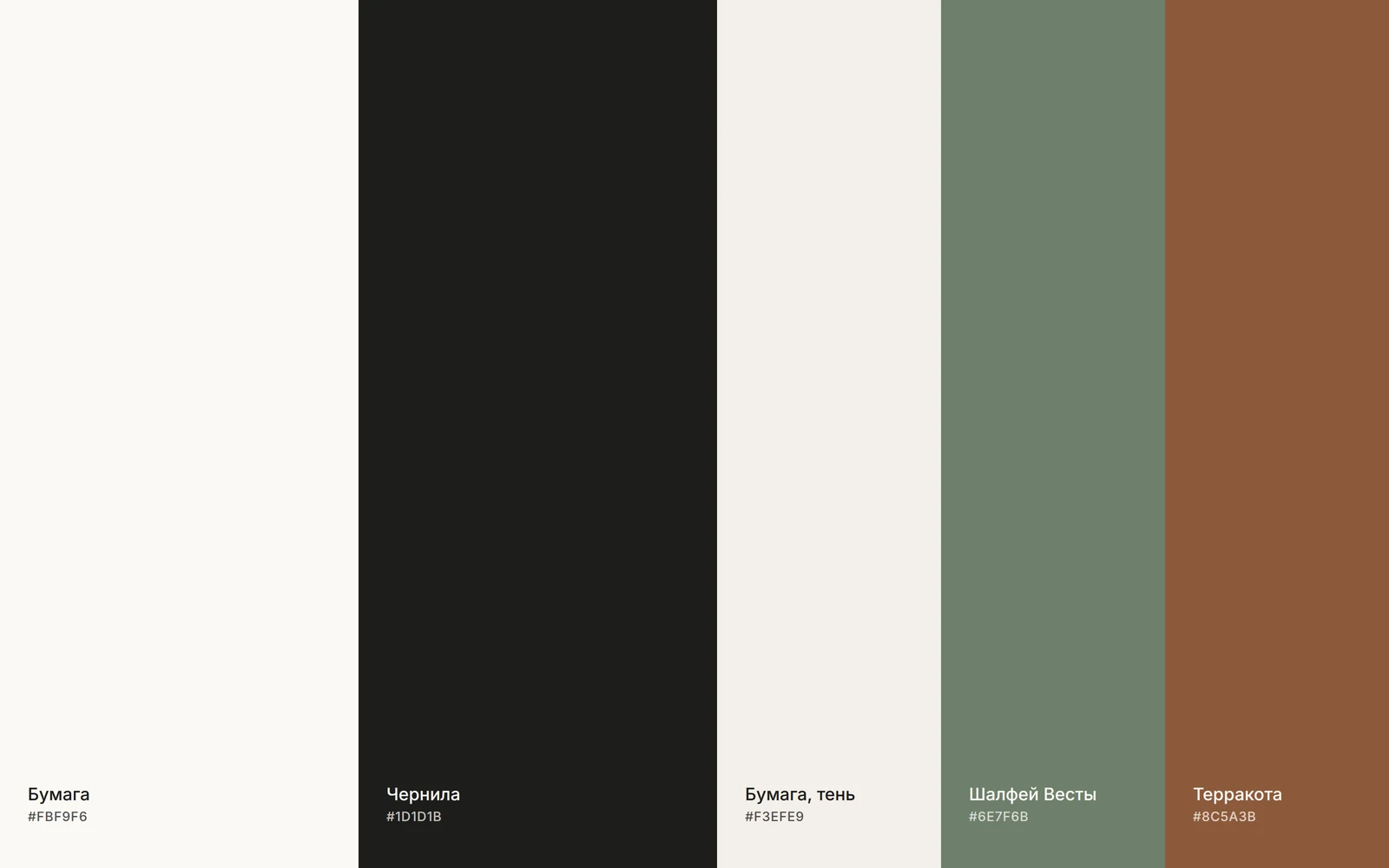
The logo itself is only ink or paper. The product’s warmth lives around it: in the warm paper, the sage of Vesta’s voice and terracotta.
Typefaces
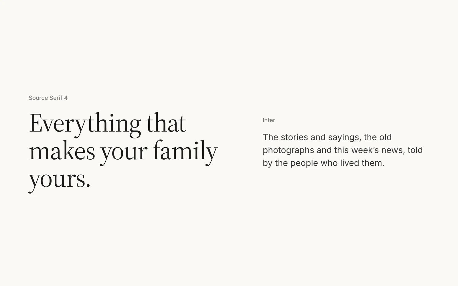
Headings are Source Serif 4 and body text is Inter. The logo’s typeface never appears in the interface: the Serund wordmark is always finished artwork.
Icons
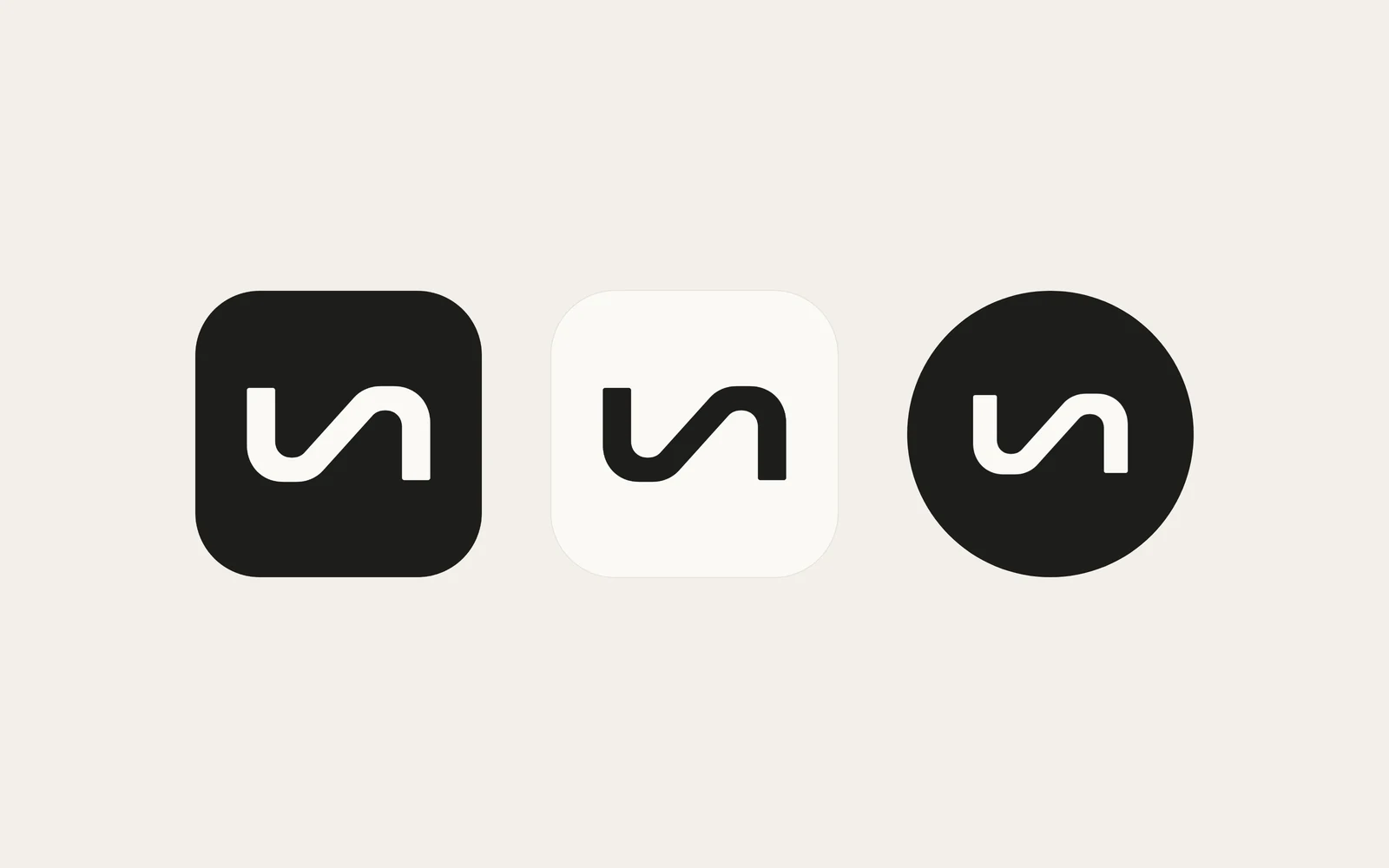
The app icon, a light version and a social avatar. The symbol fills 64% of the icon and 54% of the avatar, so a circular crop keeps some air.
Pattern
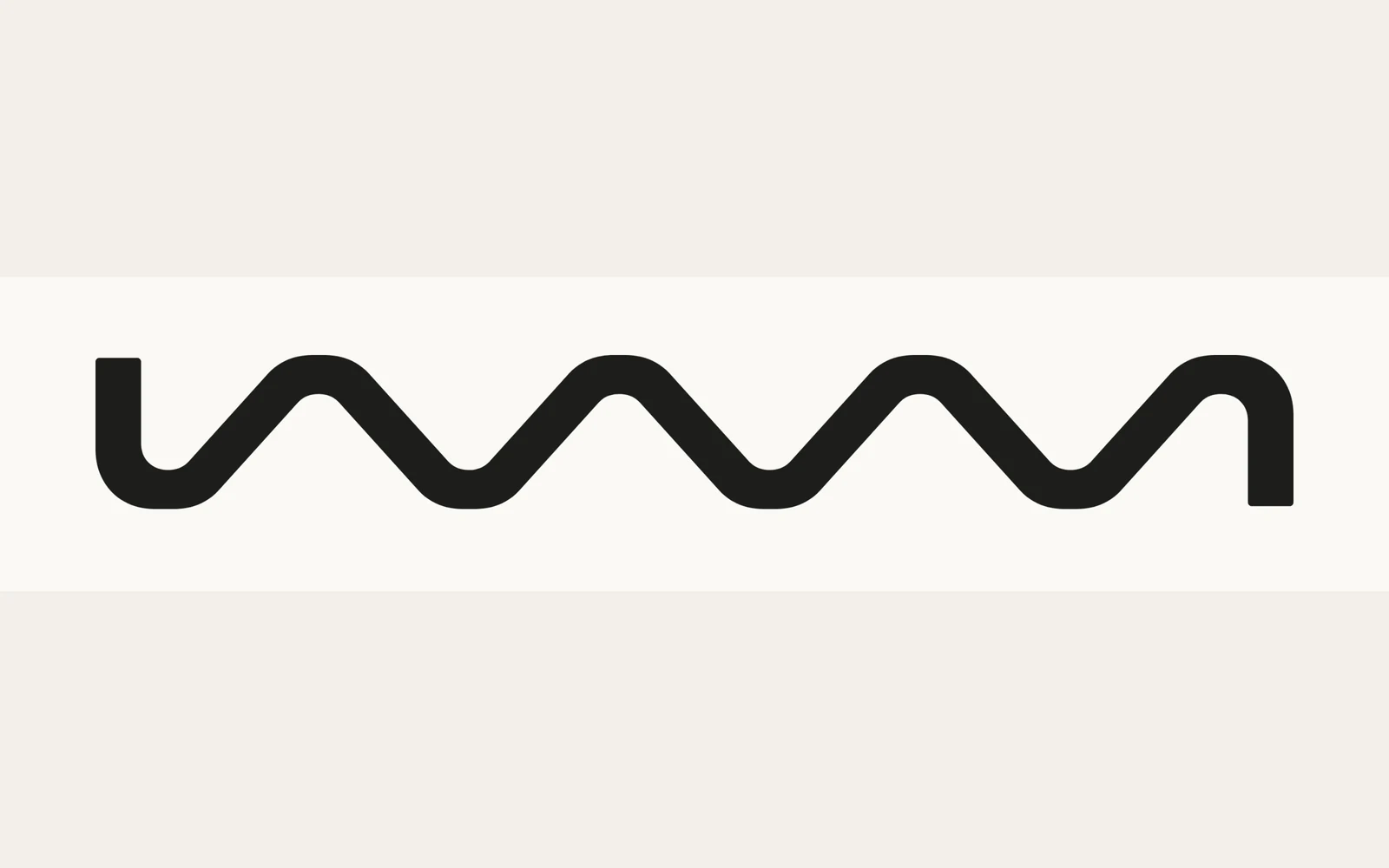
The middle of the symbol repeats as one line: bowl, diagonal, arch. The pattern is used sparingly, one strip per surface: a cover, a divider, book packaging.
Touchpoints
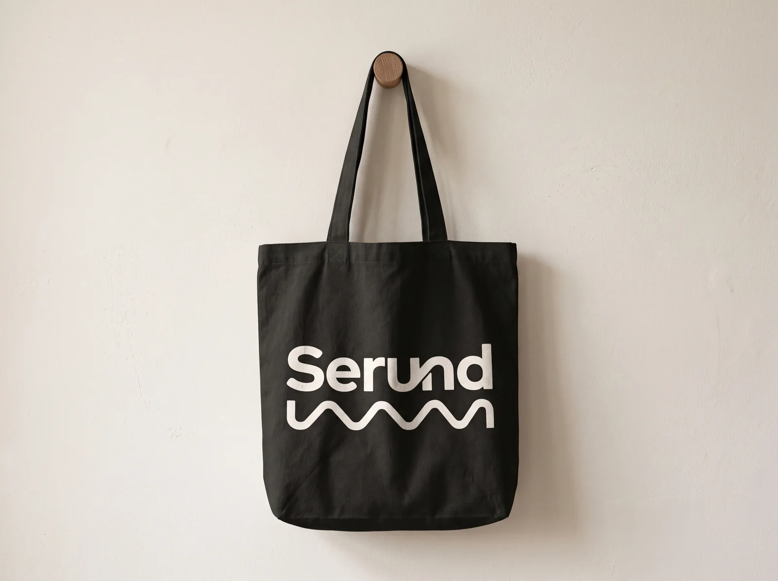
Tote bag 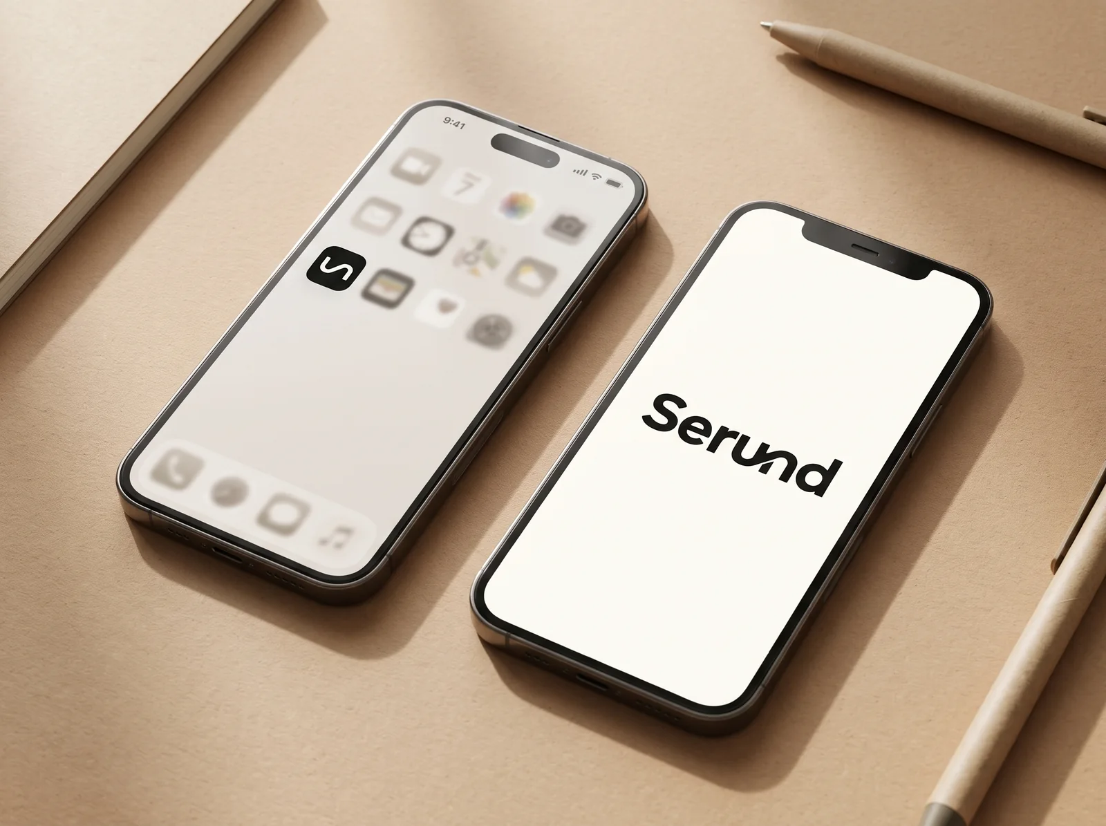
The app 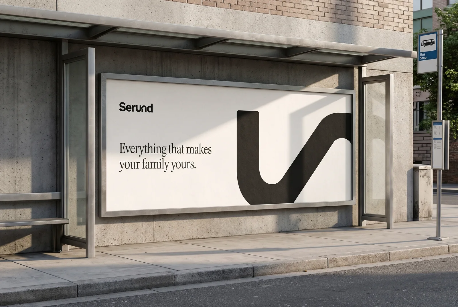
Outdoor advertising 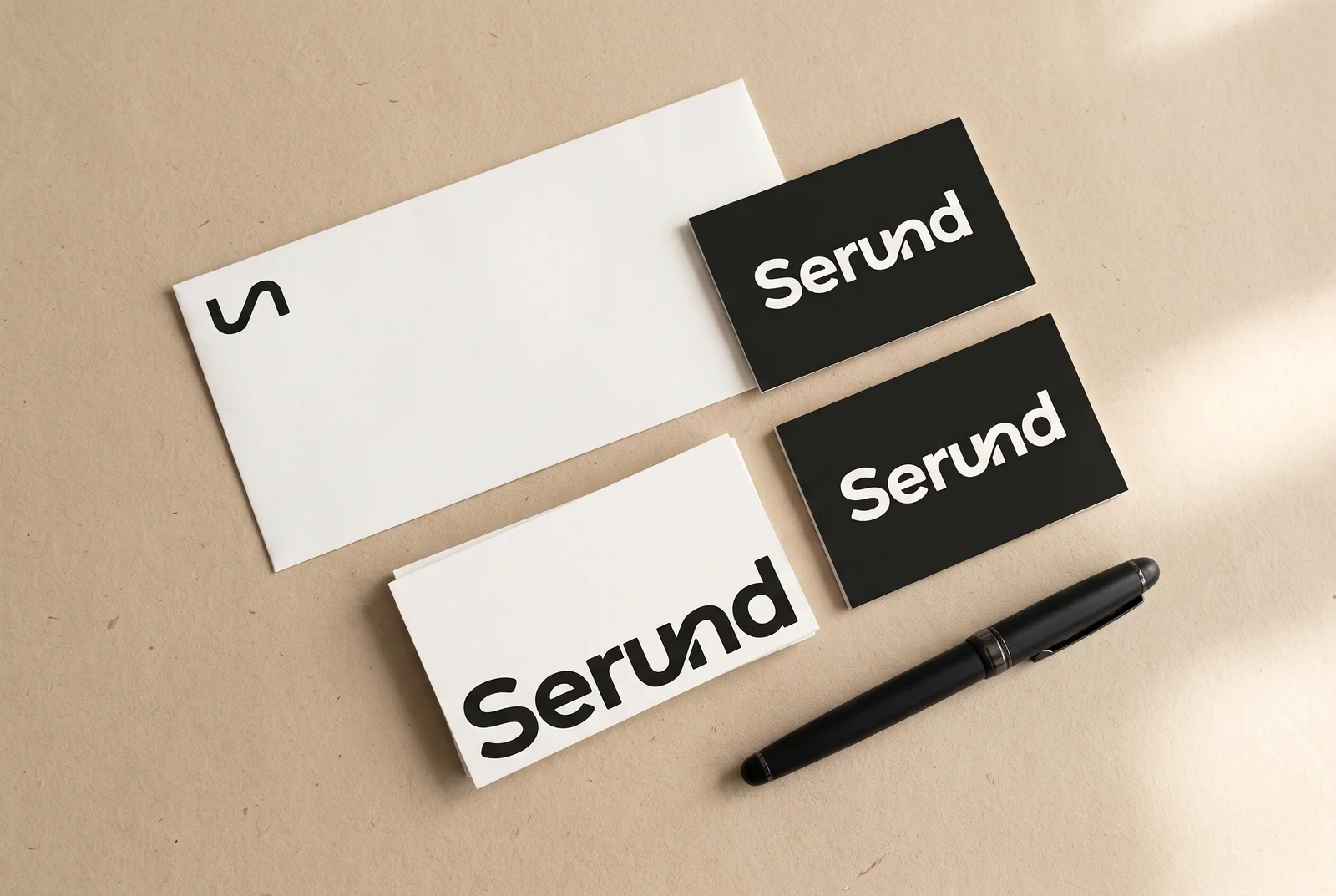
Business cards and envelope
Related services
-
Logo design services
A logo is the way your name is written, or the symbol, that people recognise on a sign, on packaging, in an app icon and in a social media feed.
-
Brand identity design and brand book
A brand identity, or corporate identity, is the set of visual elements and rules that make a brand recognisable on any touchpoint: logo, colours, typefaces, graphics and illustration.
What shall we build together?
Tell us what you want to launch or improve. We’ll discuss the task and suggest the next step.