Tondo Pizza
An Italian Art Nouveau identity for a pizzeria: an original tondo illustration, packaging and touchpoints
Task
Tondo Pizza is an online restaurant serving Neapolitan and Roman pizza. In delivery, almost every brand speaks the same language: red, a playful typeface, a close-up of pizza. The brand had to stand out and show Italian culture behind it rather than a conveyor belt, and the box had to become something people want to photograph and keep rather than throw away.
Solution
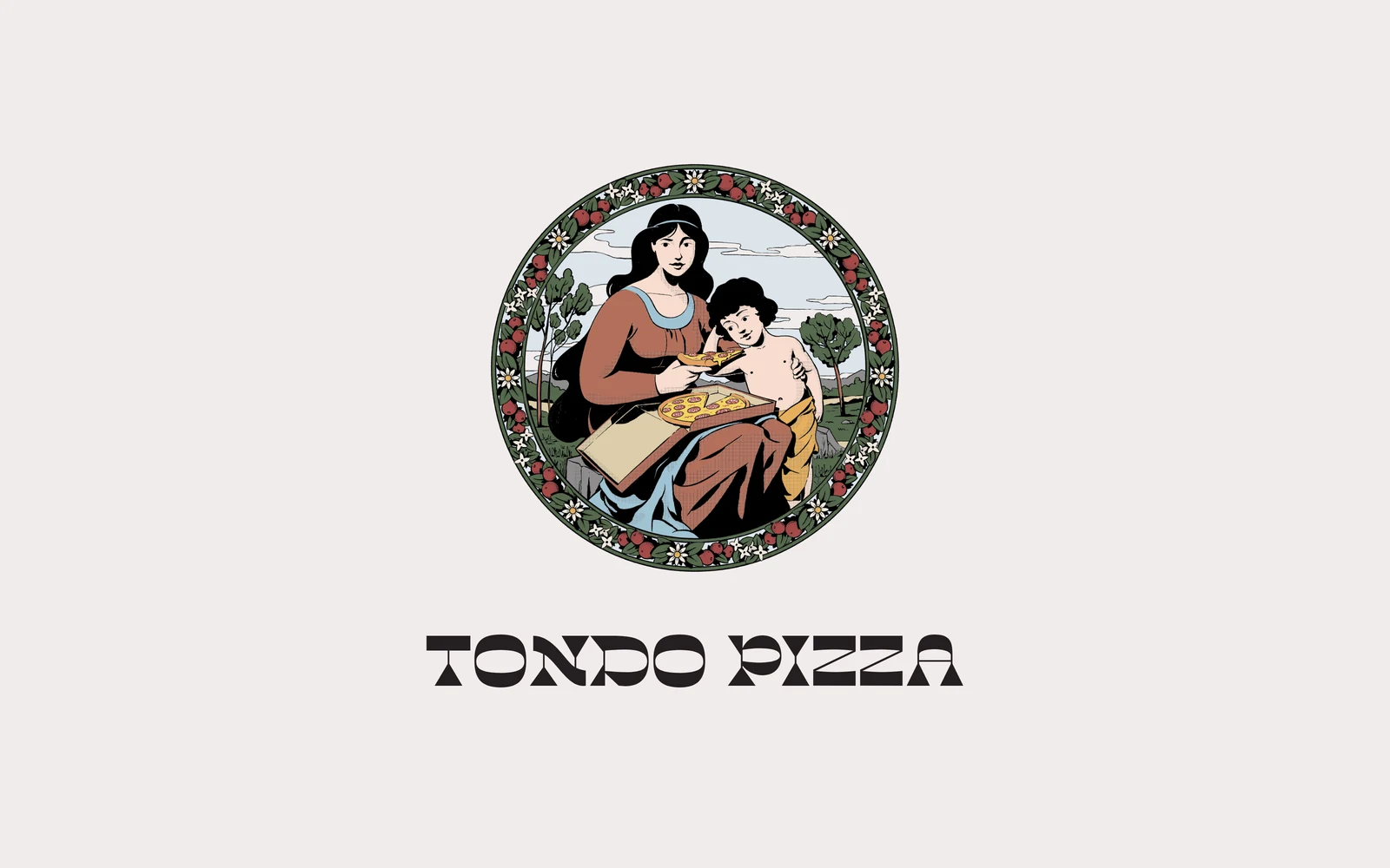
- The name suggested the concept. A tondo is a round Renaissance painting, so the identity centres on its own tondo: a mother and child with pizza, as in classic Italian subjects, framed by a wreath of tomatoes and flowers.
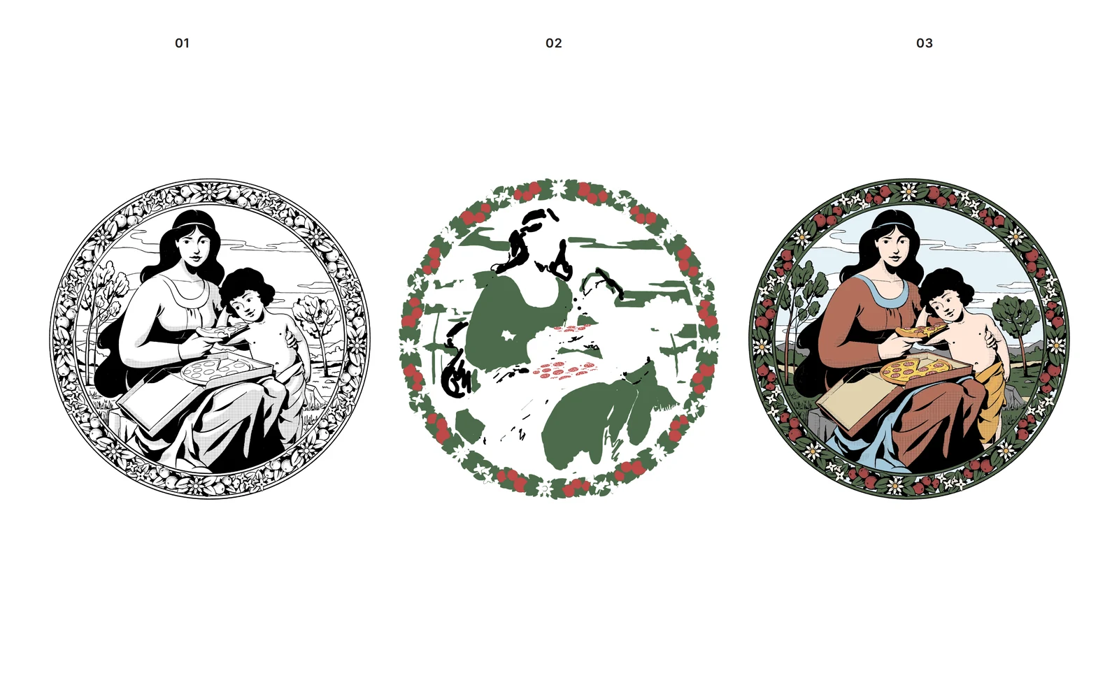
- We drew the illustration together with an artist, from an Art Nouveau ink line drawing to the colour version. A separate green monochrome version works for one- and two-colour printing.
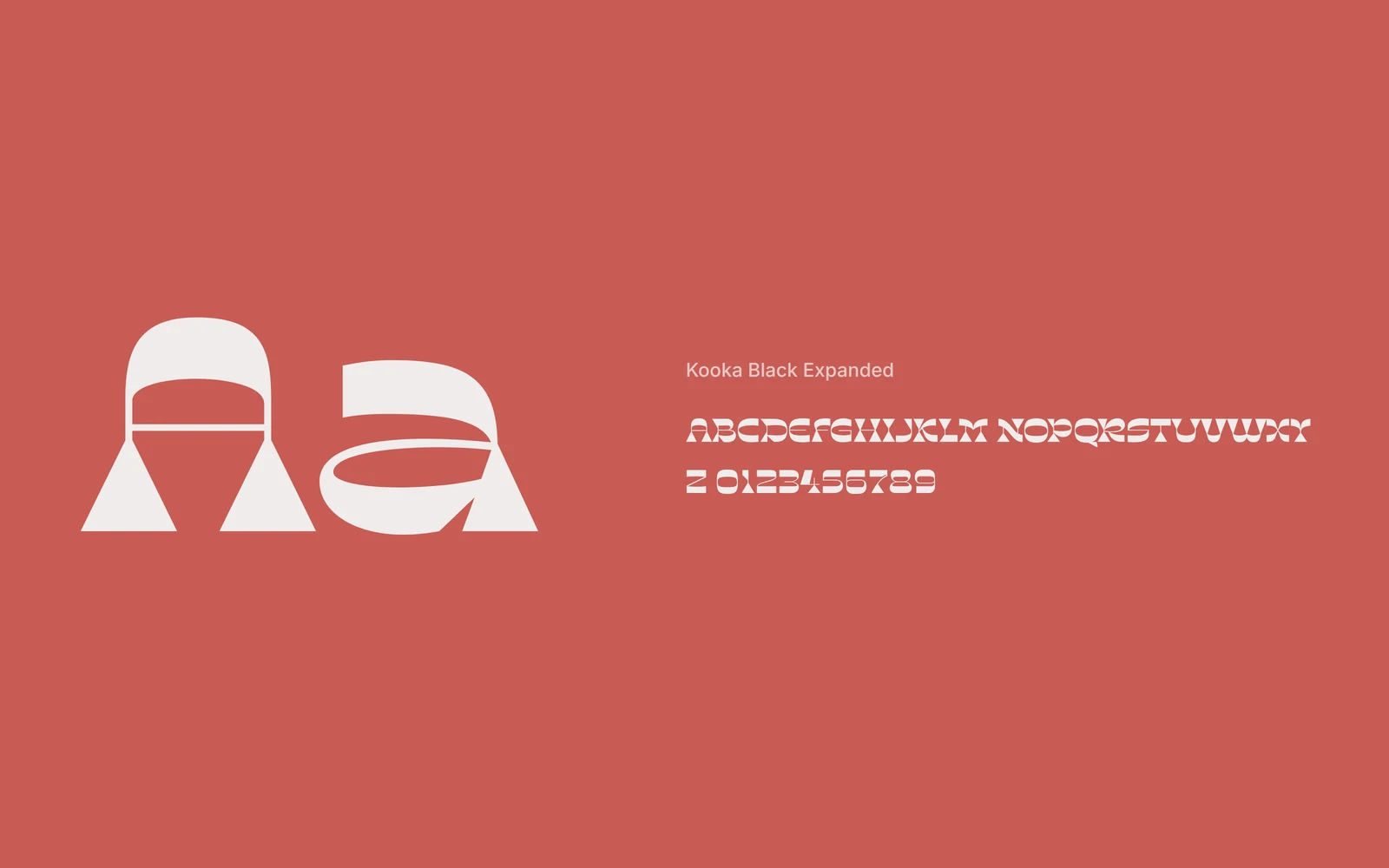
- The logo is set in Kooka, a wide typeface with sharp serifs that echoes Italian shop signs of the early twentieth century and reads well on a tiny sticker and on a 32 cm box alike.
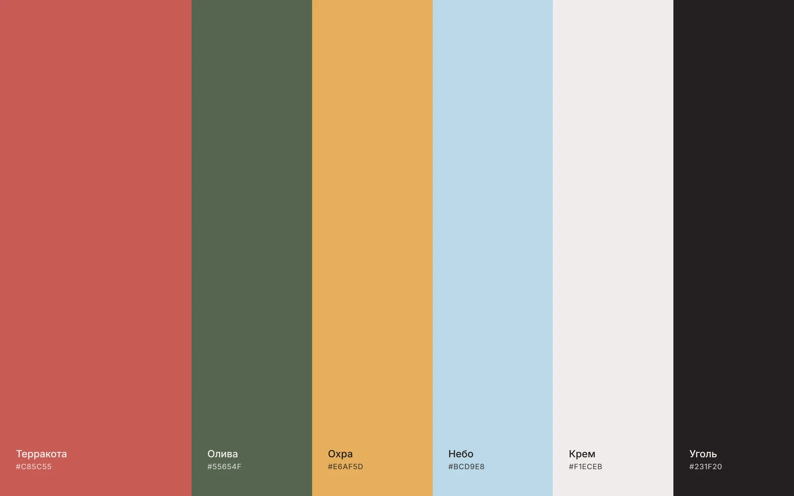
- The palette comes from Italian cooking and frescoes: the terracotta of a Neapolitan oven, olive, ochre, sky and a warm cream instead of cold white.
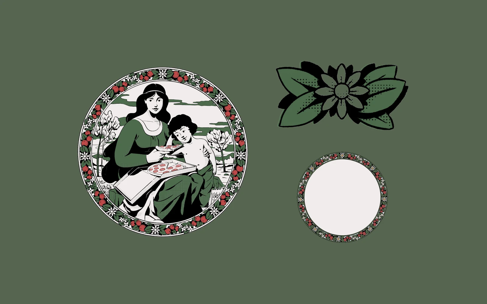
- The brand elements also work on their own: the wreath, the flower and the vertical logo are recognisable even without the illustration.
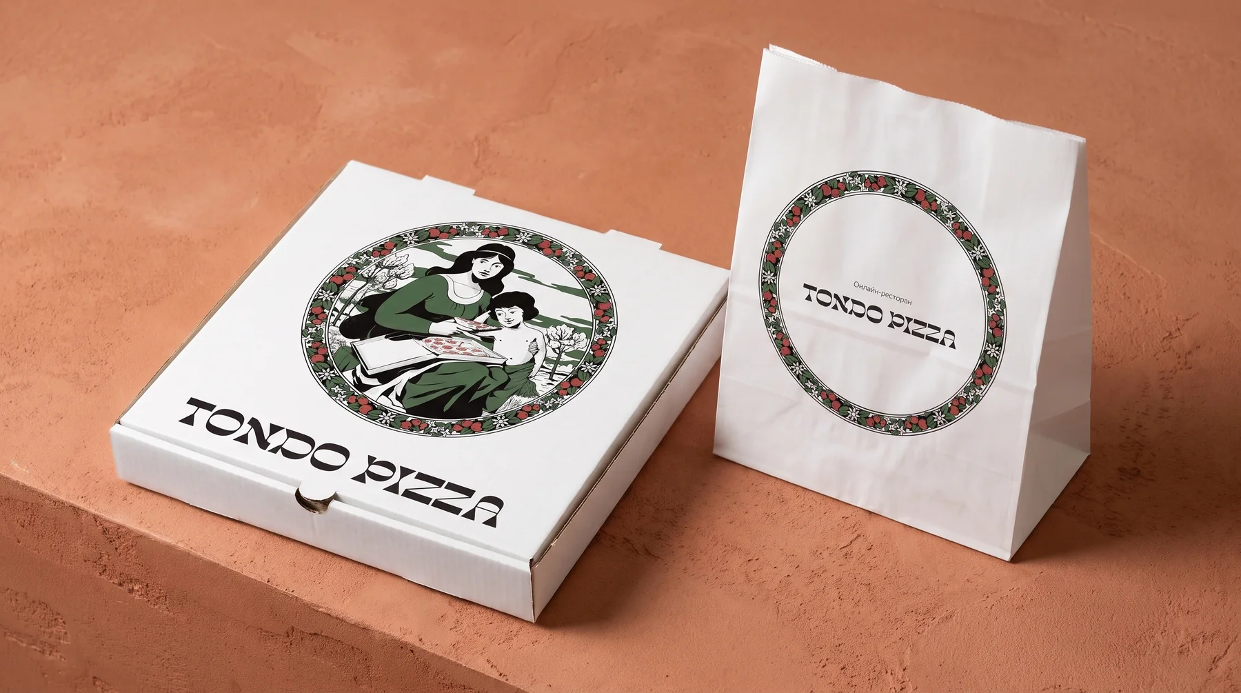
- A system of touchpoints: boxes in three sizes, bags in two formats, stickers, branded tape, paper tray liners and a menu.
Identity
Logo
A wide typeface with contrasting serifs and a self-contained tondo illustration. Together they sit on the box; separately they carry the stickers, tape and bags.
Colours
Terracotta, the colour of roof tiles and the Neapolitan oven, became the brand’s main background. Olive and ochre come from the illustration, sky adds air, and cream replaces cold white.
Typeface
Kooka Black Expanded: wide, with sharp serifs and distinctive A and Z, like the signs of Italian shops in the early twentieth century.
Illustration
First an ink line drawing, then flat colour areas and the final version. The artist worked out every detail of the wreath: tomatoes, leaves and flowers form an ornament that can be repeated on its own.
Elements
A green monochrome version for one- and two-colour printing; the flower and the wreath are standalone elements for stickers, menus and interiors.
Touchpoints
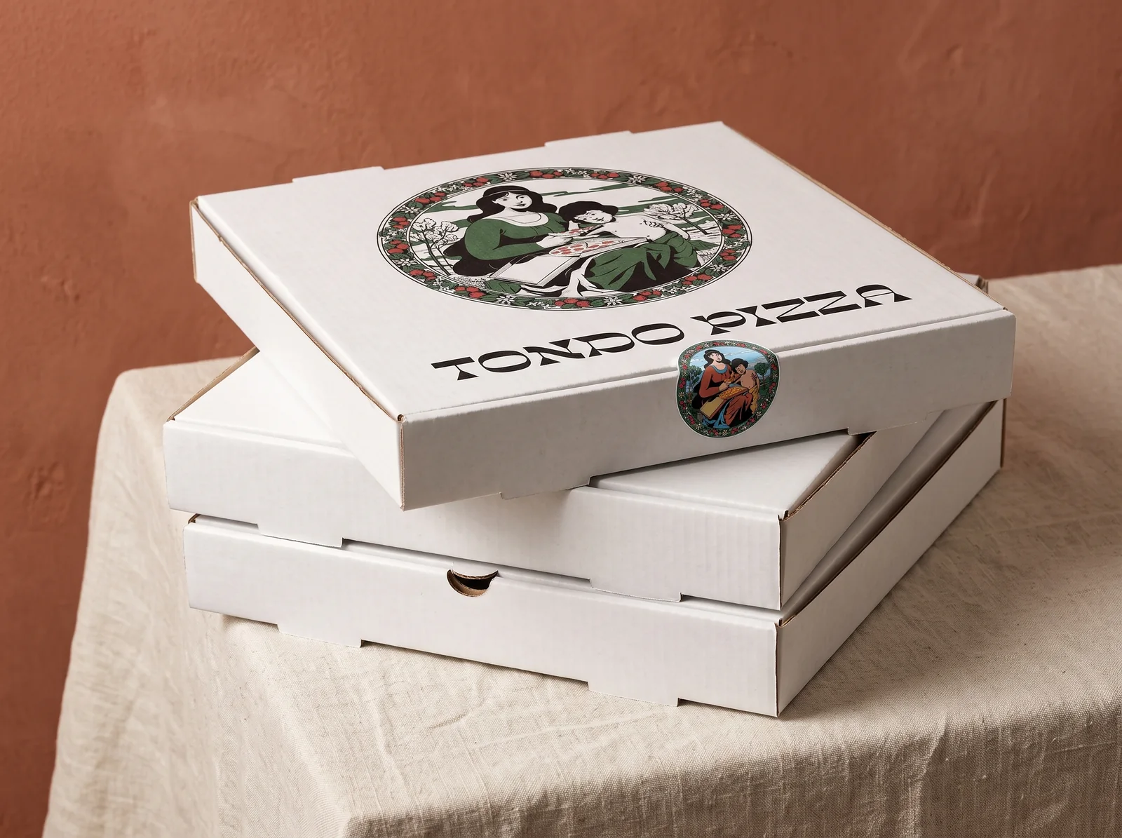
Boxes in three sizes and a round sticker 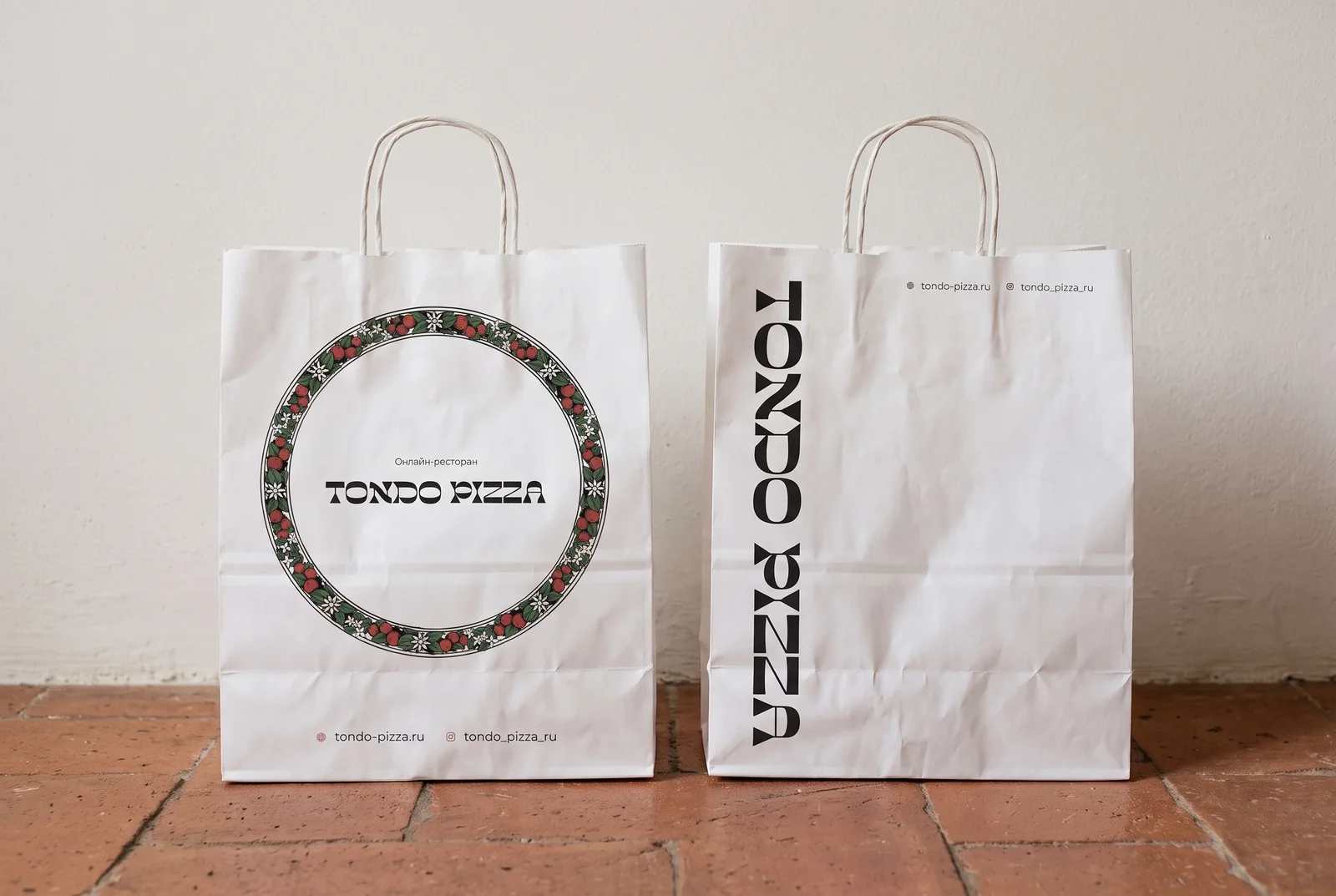
Bags in two formats 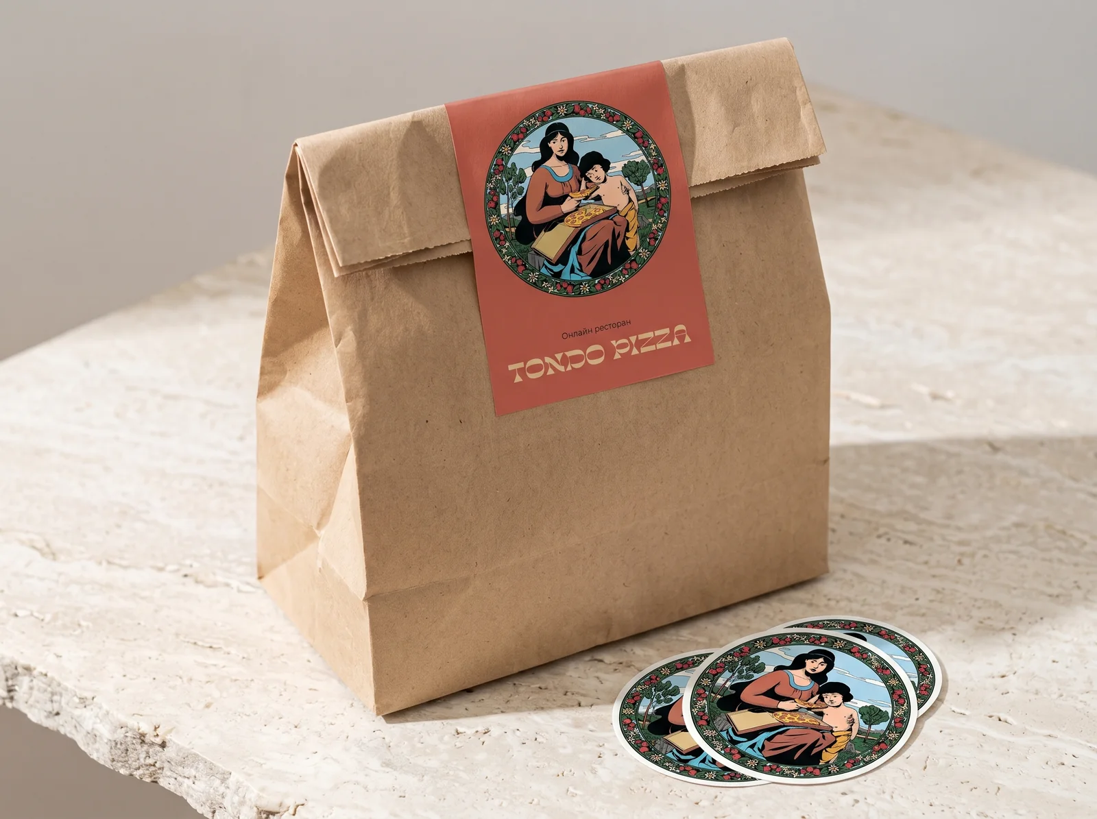
Stickers for bags 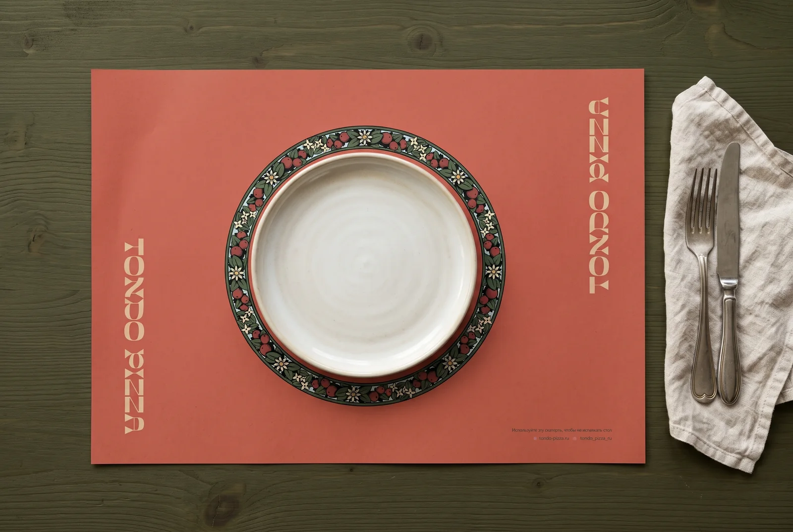
Tray liner 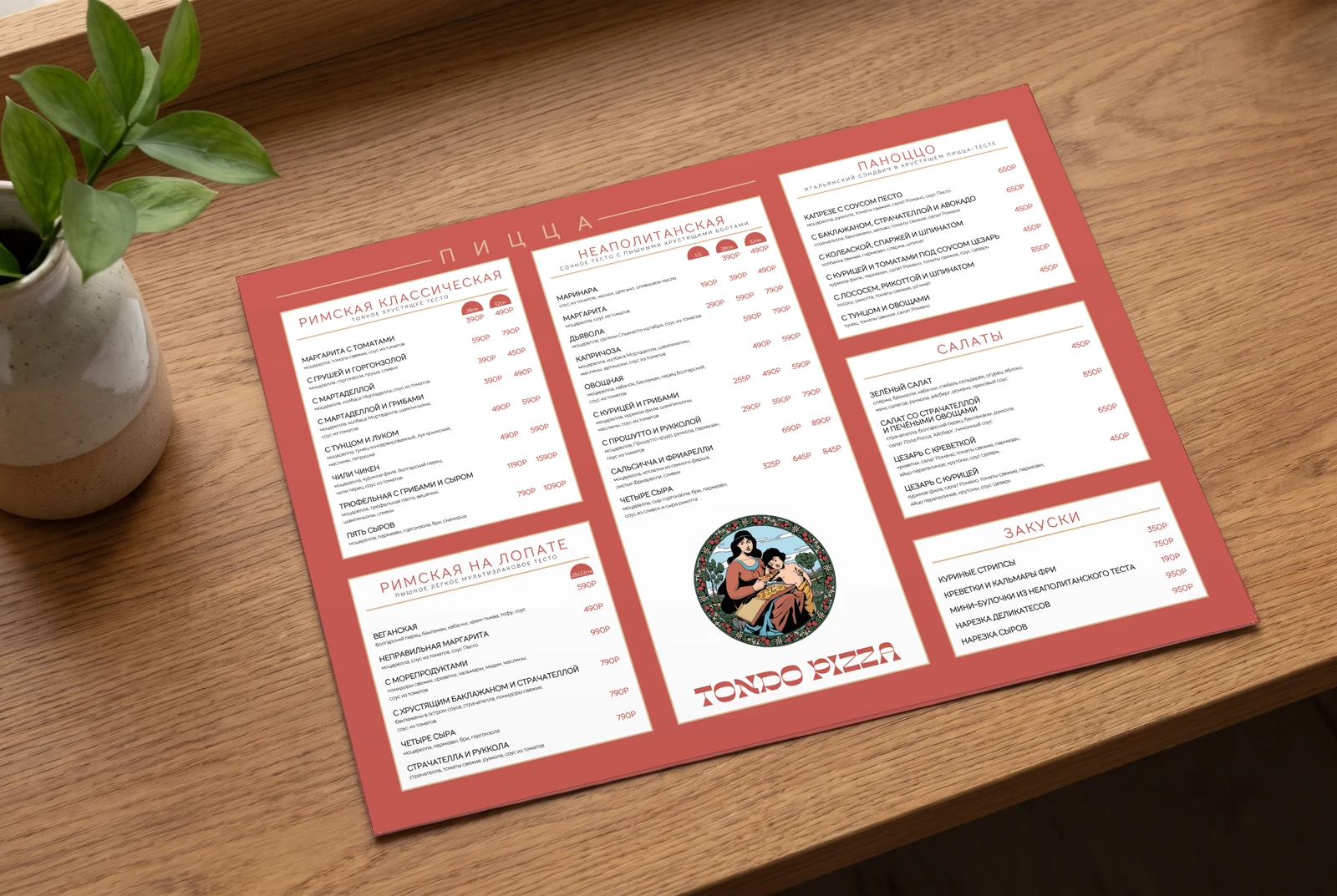
Menu 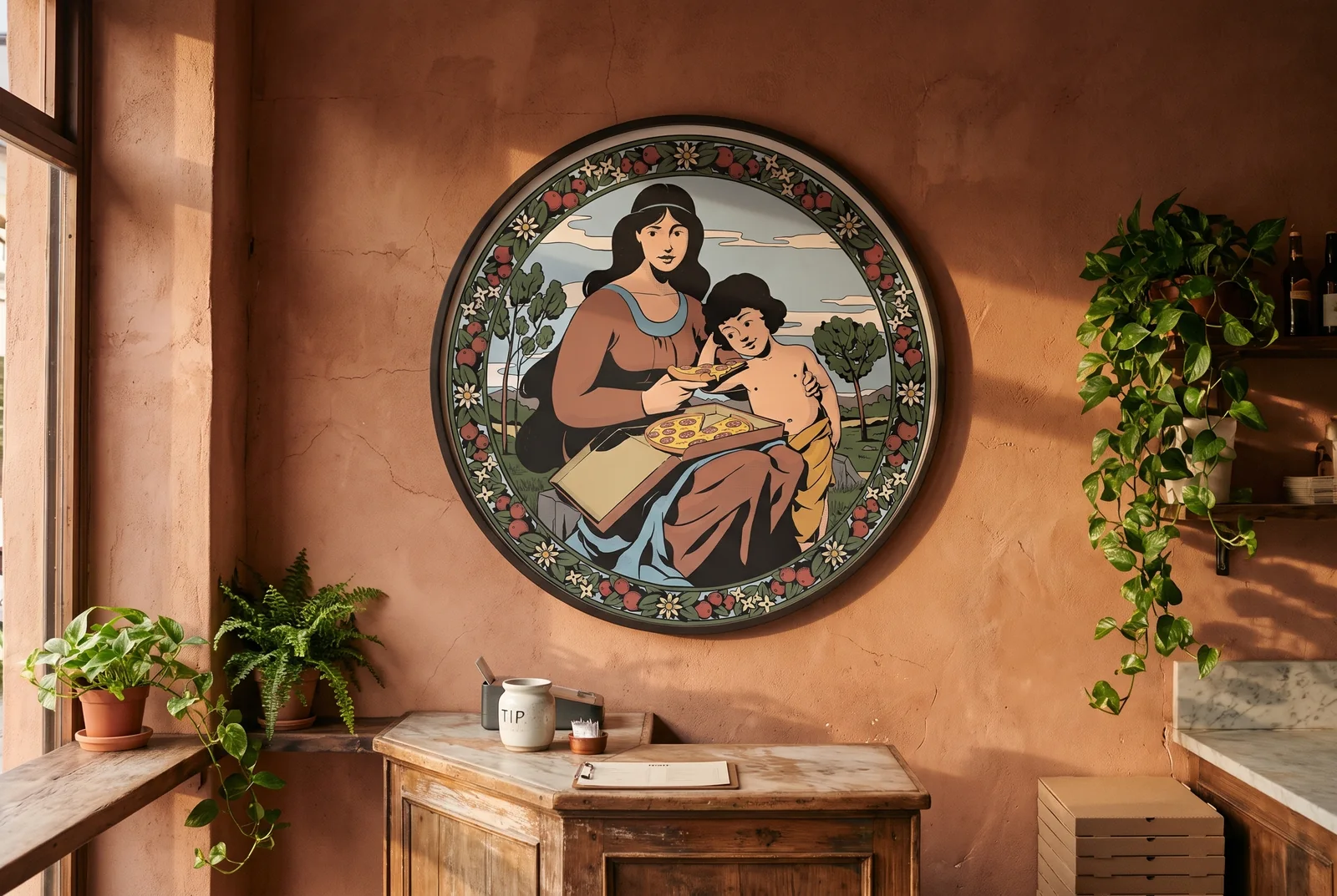
The illustration in the interior
What shall we build together?
Tell us what you want to launch or improve. We’ll discuss the task and suggest the next step.